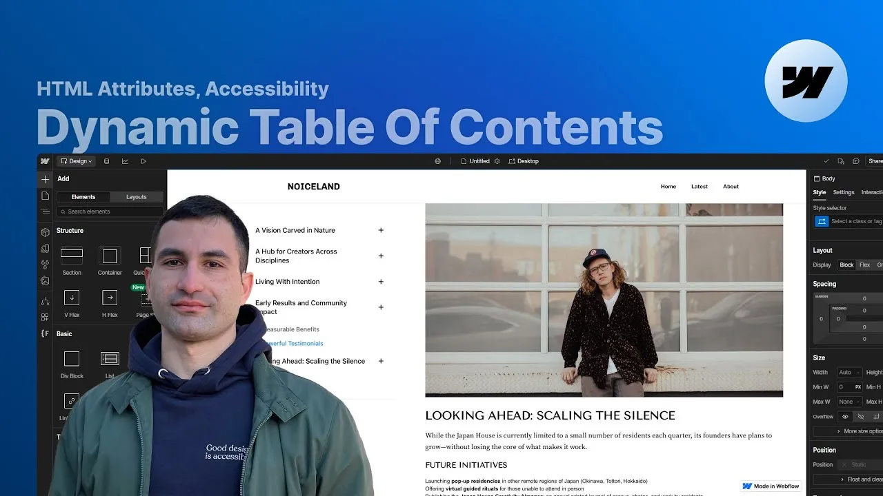
Give any long blog post a clean, responsive, and fully accessible table of contents in Webflow — with no code you have to write yourself. It generates itself from your headings, highlights the section you’re currently reading, follows you down the page, and folds into a tidy popup on mobile.
The best part is how little it asks of you. There’s no library or plugin, nothing to hand-build, and your class names don’t matter at all — the script only cares about a small set of fc-toc attributes. Label a few elements, drop in the rich-text field, and the list appears.
And it’s accessible by design, not as an afterthought: it announces itself properly to screen readers, communicates the heading hierarchy, and behaves predictably whether someone is scrolling, clicking, or tabbing through with the keyboard.
How it works
Everything hangs off one wrapper. The element carrying fc-toc="wrapper" is a two-column grid: the TOC in the first column, the actual post content in the second, aligned to the top so the sticky TOC only takes the space it needs. Inside it, the rich-text element (bound to your CMS post-content field) gets fc-toc="content" — that’s the source the script scans for headings. Point the script at that element and it walks the H2–H6 inside, builds a link for each, and injects them into the list.
That list is the heart of it. It’s an element with its HTML tag set to nav and an aria-label="table of contents", so assistive tech announces it as a named navigation region — a small change that makes a big accessibility difference. Its position is sticky with a top offset matched to your navbar height, so it follows the reader down the page. Inside sits an ordered list (ordered on purpose: it communicates sequence and hierarchy to screen readers better than an unordered one) carrying fc-toc="component" — the container the links are injected into. A capped max-height (around 50vh) with overflow: auto means the TOC scrolls internally instead of growing forever and breaking the layout.
You seed the list with one list item per heading level you want to include, and each link inside gets fc-toc="h2" (through h6). That’s how the script knows which level a link represents — include only h2 to h4 and it simply builds three levels. As you scroll, the script adds the class you’ve marked with fc-toc="active-style" to whichever link is in view, and auto-scrolls the panel to keep that active link centered. Because the active state is driven by that attribute, the name of the class is irrelevant — style it however you like.
Collapsible groups are optional and turn on with a single attribute: add fc-toc-collapse="true" to the ordered list and only the H2 links show at first, each with a toggle icon marked fc-toc="open-group" (and fc-toc-rotate for how far it spins when open). Groups expand automatically as you scroll into them and collapse as you leave — with one thoughtful guardrail: a group holding the currently active link can’t be manually closed, so you never lose track of where you are. One catch worth remembering: the collapsible wrapper relies on a helper element with the exact class toc-subitems, which the script looks for by name — it must be spelled exactly and live on the same page.
On small screens the TOC would eat too much room, so it converts into a popup panel: a sticky button (built with the actual button tag) triggers a click interaction that slides the panel up from the bottom over a blurred, semi-transparent background. Tap the background or a link and it slides back down and hides. This lives on a Webflow interaction from the tablet breakpoint down — no extra attributes needed.
How to use it
-
Clone the project. Grab the Webflow cloneable — it ships with the full structure, the commented script, and a complete attribute reference on the project’s homepage. It’s built on the free Notable blog template.
-
Mark the wrapper and content. Put
fc-toc="wrapper"on the two-column container that holds the TOC and the post body, andfc-toc="content"on the rich-text element whose headings you want listed (typically your CMS post-content field). -
Set up the TOC element. On the TOC container, set the HTML tag to
navand addaria-label="table of contents". Give itposition: stickywith a top offset that matches your navbar height. -
Build the list scaffold. Inside, add an ordered list with
fc-toc="component". Add one list item per heading level you want, and on each item’s link setfc-toc="h2"…fc-toc="h6"to match. Cap the list withmax-heightandoverflow: auto. -
Mark the active style. On the class you want applied to the in-view link (a colored left border, a different text color — whatever you like), add
fc-toc="active-style". The script toggles this class as you scroll. -
(Optional) Turn on collapsible groups. Add
fc-toc-collapse="true"to the ordered list. Give the H2 list item a toggle icon withfc-toc="open-group"(andfc-toc-rotateif you want a rotation other than -45°), and add the requiredtoc-subitemshelper element (spelled exactly) on the page withoverflow: hidden,max-height: 0, and amax-heighttransition for the smooth open/close. -
Check mobile. The cloneable already includes the sticky open button and the slide-up popup interaction from the tablet breakpoint down — publish and test that the panel opens, links jump to the right heading, and the active link stays centered.