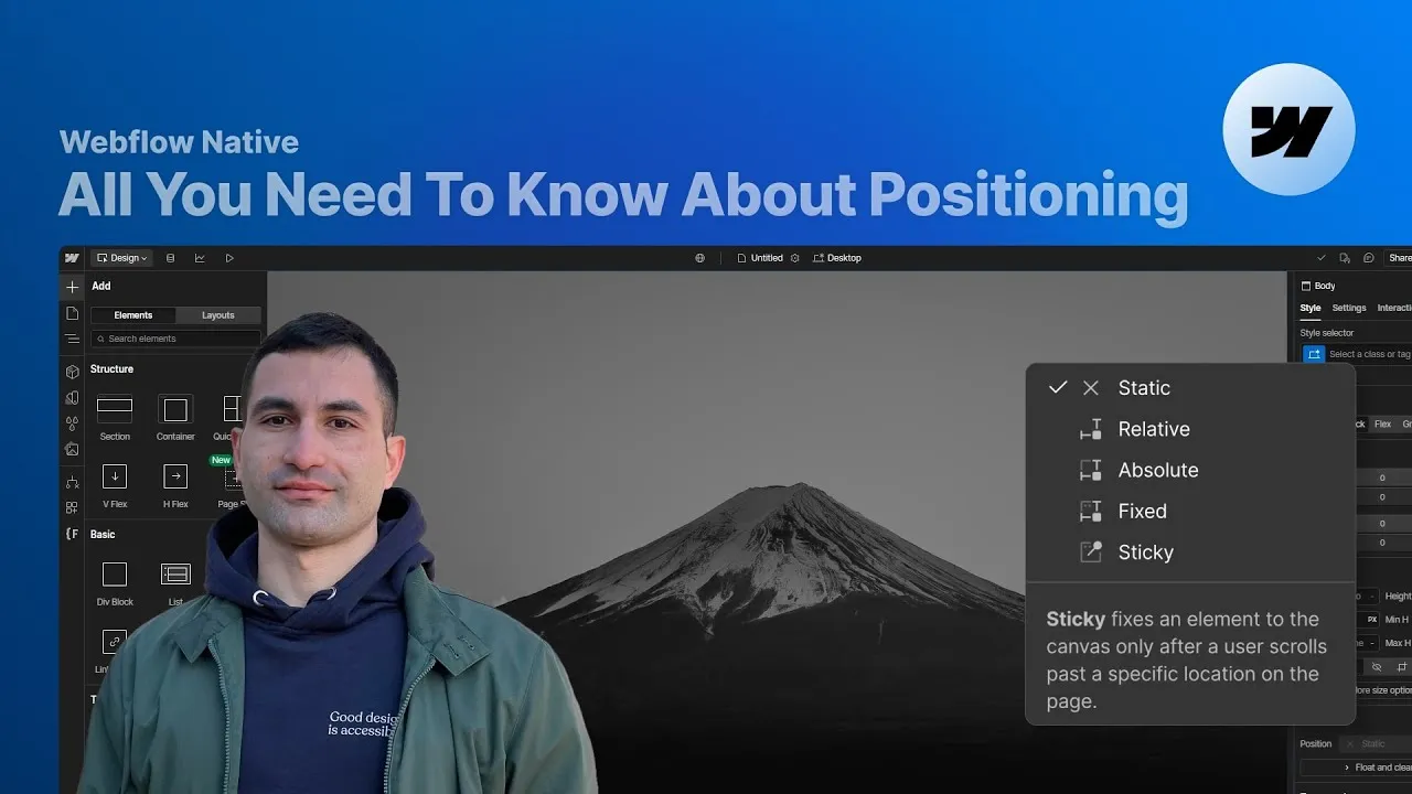
By the end of this lesson you’ll finally have position figured out — static, relative, absolute, fixed, and sticky — not as five vocabulary words, but as five predictable behaviors you can reach for on purpose. Once it clicks, you build cleaner layouts and fix alignment problems before they become problems.
Positioning looks simple and then quietly confuses everyone at some point: the offsets don’t do what you expect, an element vanishes, or a sticky refuses to stick. The trick is that each value answers two questions — am I still in the normal flow? and what do my offsets measure against? Get those two straight for each value and the whole property stops being mysterious.
Let’s go through all five with the same tiny setup — a card with a badge inside — so you can see exactly what changes when you flip one property.
How it works
Static is the default. It means “leave me alone, I’m part of the normal flow” — one block after another, no floating, no overlapping. You can’t use offsets on a static element, but you can still shift it visually with a move transform, and the layout behaves as if it never moved (percentages in a transform are relative to the element’s own size). It’s the do-nothing setting, and sometimes that’s exactly right.
Relative looks identical to static until you use it — the element stays in the flow. What it unlocks is offsets (top/right/bottom/left) and z-index. Offsets shift the element visually without affecting anything around it, so left: 4rem slides it over while its neighbors act like it never left. It’s also how you control stacking order independent of DOM order. But the real reason relative matters comes next: it’s the anchor for absolute children. (Percentage offsets here are relative to the parent — and get unreliable if the parent has no defined height or uses flex/grid.)
Absolute takes the element out of the flow — everything else reclaims its space as if it were gone — and anchors it to a reference point: the first ancestor with a non-static position. Set the parent to relative and an absolute badge with top: 0; left: 0 pins to the card’s corner. Remove that relative and the badge jumps to the next positioned ancestor up the tree, or the body if there is none. With no offsets at all, it stays visually where it was but stops affecting layout. Percentage offsets are relative to that reference (the containing block). This is your tool for anchoring one element to another — a badge, a decorative image in a hero corner, a tooltip.
Fixed also leaves the flow, but here’s the key difference: it always anchors to the viewport, no matter what its ancestors do. Give the badge top: 0; right: 0 and it pins to the corner of the screen and stays there as you scroll. Percentages are relative to the viewport. One gotcha worth knowing: a fixed element still belongs to the stacking context of the section it lives in, so later sections with their own z-index can cover it — the fix is to raise the parent section’s z-index, not the element’s. The classic use is a fixed navbar (e.g. position: fixed; top: 1rem; left: 1rem; width: calc(100% - 2rem) to sit it neatly inset from both edges).
Sticky is the hybrid — relative until a scroll threshold, then fixed. Apply it with a top: 0 and nothing happens until the element’s top edge reaches the top of the scroll container; then it locks there and rides along until its parent ends, at which point it lets go. It works on any edge (sticky-top, sticky-bottom, and even sticky-left inside a horizontally scrollable container), and its offsets are measured against the nearest scrollable ancestor. The big gotcha: sticky breaks if any ancestor has overflow set to anything other than visible or clip (auto, scroll, or hidden all kill it), because it can no longer measure the flow it needs. If a sticky won’t stick, check the parents first.
How to use it
- Anchor a badge to a card corner. Give the card
position: relative, give the badgeposition: absolute, then pick a corner (e.g.top: 0; left: 0, or Webflow’s bottom-left preset). The badge sits exactly where you want and never disturbs the card’s text. - Build a fixed navbar. Set the navbar to
position: fixed,top: 1rem,left: 1rem, andwidth: calc(100% - 2rem). Theleftoffset plus thecalcwidth leave equal breathing room on both sides while it stays pinned to the top. - Keep fixed UI visible across sections. If your floating button or badge disappears past the first section, raise the
z-indexof its parent section (not just the element) so its whole stacking context wins. - Pin a table of contents. In a two-column grid, set the TOC to
position: sticky; top: 150px. If it won’t stick, change the grid’s vertical alignment to top so the TOC only takes the height it needs and has room to move. - Keep the first column of a scrollable table visible. In a horizontally overflowing flex row, give the first column
position: sticky; left: 0— it stays locked to the left while the rest scrolls. - Add a revealing footer. Set the footer to
position: sticky; bottom: 0. That single property gives you the “footer revealed on scroll” effect with no interactions or code. - When something misbehaves, check two things: is an ancestor’s
overflowbreaking your sticky, and is yourz-indexfighting a stacking context you didn’t notice?
Nail these five and positioning stops being guesswork. Each value is just a clear answer to “in the flow or not?” and “measured against what?” — and once you know both, you can place anything, anywhere, on purpose.