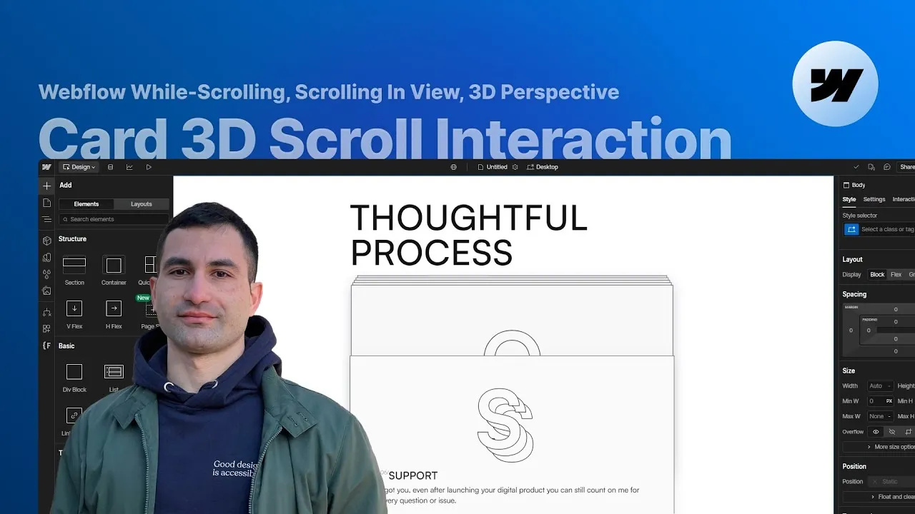
In this lesson you’ll build a 3D card while-scrolling animation in Webflow — the kind where cards rise one after another and drift back into space as you scroll, perfect for a testimonials wall or a step-by-step process. And you’ll build it with no code at all, using Webflow’s native interactions.
It looks fancy, but it comes down to a few honest ideas: a tall section for scroll room, a sticky container that holds everything in place, a timeline that turns scrolling into motion, and a touch of perspective for depth. Get the setup right and the animation almost builds itself.
The other quiet theme here is responsiveness. Every value is thought through in viewport units so the whole thing flexes across devices — because an animation that only looks great on the screen you built it on isn’t finished. User experience comes first.
How it works
The stage: a tall section plus a sticky container. The section is set much taller than the screen (in the project it’s 600VH) so there’s plenty of scroll to work with — and that height is what controls the speed: taller means slower. Inside it, the main container is where the magic lives. Set its height to 100VH and, crucially, its position to sticky with a top offset of 0. That pins it to the top of the viewport for the entire section, so the cards stay put and play their animation while you keep scrolling. Forget this one setting and nothing works.
The layout, sized for every screen. A top padding of 10VH keeps the whole experience comfortably inside the viewport, and the heading wrapper gets a fixed 25VH height so there’s always breathing room below it — no matter the font size — before the cards begin. The cards themselves are absolutely positioned and stacked on top of each other inside a card list, sized in percentages with a max-width so they don’t blow up on huge screens. VH units show up everywhere on purpose: they’re what makes the animation responsive by nature.
The depth: perspective on the parent, translateZ on the children. This is the mental model worth keeping. To get true 3D, you set a children perspective on the parent element — the card list gets a children perspective of 3000px, and its position is relative so it acts as the reference for the absolutely-positioned cards. Perspective is like the distance between your eye and the scene: it lives on the container. The movement lives on each child — animating a card’s translateZ to a negative value pushes it away from you, and because the parent has perspective, that reads as receding into depth rather than just shrinking. Parent holds the lens; children do the moving.
The timeline: movements you can count. The animation is applied to the section as a “while scrolling in view” interaction. You decide the story first — the front card starts half-visible, the rest hidden below the fold, and each one pushes up in turn like cards held in your hand. Six cards means six movements, so you split the timeline roughly evenly, preview, then even out the keyframes to fill any leftover space. Then you layer in the depth: as each card settles, the ones behind keep drifting up a hair and back along Z, and a card overlay fades from transparent to a faint dark tint to deepen the sense of distance.
The numbers follow one rule. What looks like a lot of hand-tuned keyframes is really a single pattern. Card 1 starts at Y 32.5VH (half-visible, peeking into frame); every other card starts at Y 65VH, fully below the fold. Each card then settles at Y 0, Z 0, overlay alpha 0 — and from that moment, every time a new card arrives, it steps back by another −1VH on Y, −4VH on Z, and +0.01 overlay alpha. So a card’s recede depends only on how many cards come after it:
| Card | Start | Recede steps | Final resting values |
|---|---|---|---|
| 1 | Y 32.5VH | 5 | Y −5VH, Z −20VH, alpha 0.05 |
| 2 | Y 65VH | 4 | Y −4VH, Z −16VH, alpha 0.04 |
| 3 | Y 65VH | 3 | Y −3VH, Z −12VH, alpha 0.03 |
| 4 | Y 65VH | 2 | Y −2VH, Z −8VH, alpha 0.02 |
| 5 | Y 65VH | 1 | Y −1VH, Z −4VH, alpha 0.01 |
| 6 | Y 65VH | 0 | stays at Y 0, Z 0, alpha 0 |
The last card never recedes, because nothing arrives after it. Read that way, the whole timeline is one increment repeated — which is also what makes it easy to extend to more cards.
How to use it
-
Set the stage. Give the section a tall height (e.g. 600VH) for scroll room — remember, taller = slower. Inside it, add a main container: height 100VH, position: sticky, top: 0. Add a top padding (e.g. 10VH) so everything stays inside the viewport.
-
Lay out the content. Add a heading wrapper with a fixed height (e.g. 25VH) so there’s guaranteed space below it. Then a card list holding your cards. Size the cards in VH/percentages with a max-width, make each card absolutely positioned so they stack, and set the card list’s position to relative.
-
Add the perspective. On the card list, set a children perspective (e.g. 3000px). This is what turns your Z moves into real depth — without it, the cards would just resize.
-
Build the base movement. Add a “while scrolling in view” interaction to the section. For each card, add a move action that starts it hidden below the fold (a positive Y offset) and a second keyframe that brings it to Y 0. Count your cards, split the timeline into that many even movements, preview, then adjust the keyframes so the last one lands near the end (in the project they settled on keyframes at 9, 27, 45, 63, 81, 99%).
-
Layer in the 3D depth. For the cards behind the current one, add keyframes that step them back by −1VH on Y and −4VH on Z for each newly arriving card (see the table above for each card’s totals), so they recede as the stack grows. Make sure the Z transform on your earlier move actions is set to 0 so it doesn’t fight the depth.
-
Add the overlay tint. Give each card an absolutely-positioned overlay with pointer-events: none. Animate its background alpha up by +0.01 per arriving card across the same keyframes (so the front card ends at 0.05), making cards subtly darken as they move into the distance.
-
(Optional) Combine with scroll-into-view. Add a separate “scroll into view” interaction on the card element to animate something inside it (e.g. letters sliding to overlap) as it enters, reverting on scroll out of view. Trigger it on the shared card class so Webflow applies it to every instance automatically, and tune the offset to time it nicely.
-
Check responsiveness and publish. Because you built in VH from the start, most of the work is done — apply the usual per-breakpoint sizing tweaks, publish, and test the live link across screen sizes.