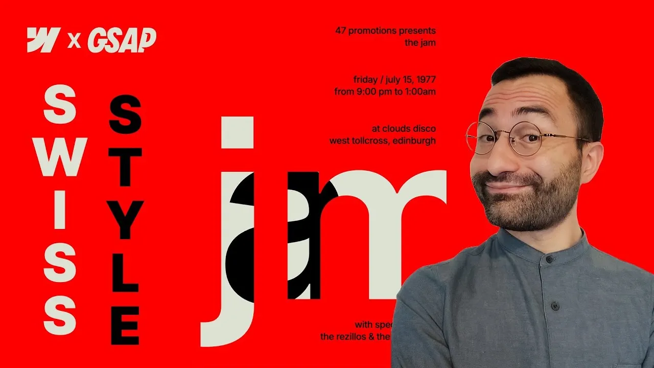
This lesson recreates a modernist Swiss-style poster in Webflow and brings it to life with GSAP — a full-viewport composition where the letters “JAM” are cut out of a red field, then slide in and out in a looping, cinematic sequence. It’s one of my favorite kinds of build: half of it is quiet layout craft, the other half is motion, and the two have to meet in the middle perfectly.
We’ll go through it in the order it was built. First the structure and typography, sized so the whole thing behaves like a printed poster. Then the trickiest part — cutting the letters out with a CSS clip-path shaped in Figma. Then two GSAP interactions: a staggered text reveal and a slide-mask sequence for the big letters. And finally the small fixes that separate a demo from something you’d actually ship: an anti-aliasing sliver, responsiveness, and the flicker you get when GSAP loads.
None of the individual pieces are hard. The magic is in how they stack.
How it works
A poster that fits the viewport. The section is 100vh with a red background, and the content wrapper is sized to feel like print: a 2:3 aspect ratio, flex column, aligned to the bottom so the big letters sit low like a real flyer. The key decision is units — all the text is sized in vh and letter-spacing in em. That’s deliberate: by tying type to viewport height, everything scales down together on shorter screens, so the composition never overflows vertically. It’s the same instinct as designing to a fixed poster frame.
Cutting the letters out. This is the heart of the build. We don’t draw the letters — we cut them out of a solid red block using a CSS clip-path, and a clip-path only shows what’s inside its shape. So the shape we need isn’t the letters themselves, it’s the negative around them. That shape is built in Figma: type “JM”, convert to a vector, delete the anchor points that form the dot on the J, drop a rectangle behind it, and run a boolean subtract so the letters are carved out of the rectangle. Export that as SVG. The letter A is handled separately — it’s a plain SVG with fill: currentColor so it inherits its parent’s color, sitting in its own wrapper so it can be animated on its own later.
Normalizing the path. An exported SVG path speaks in absolute pixels. A CSS clip-path set to objectBoundingBox speaks in a 0–1 range so it can scale with whatever element it clips. Bridging the two is “normalizing”: multiply every coordinate by 1/width and 1/height. The SVG Path Editor does this for you — paste the path data, note the SVG’s width and height, and run a scale with 1/width and 1/height. In the video’s case that was 1/15 ≈ 0.067 and 1/11 ≈ 0.091. The result is a path that maps cleanly onto any box.
Here’s the finished embed from the cloneable — the normalized “JM” negative shape. Yours will have a different d (it’s specific to your letters and their original dimensions), but the wrapper is exactly this:
<!-- Embed at the very top of the page, position: absolute -->
<svg>
  <clipPath id="jm" clipPathUnits="objectBoundingBox">
    <path d="M.9996 1H0V0H.9996V1ZM.1385.1075V.715C.1385.7393.1345.7577.1263.7702.1181.783.1045.7893.0856.7893.0832.7893.081.7892.0788.789.0766.789.0741.7888.0714.7886V.8992L.0916.9C.1225.9.1488.8933.1704.8801.1921.8668.2087.8467.2201.8197.2316.7927.2373.7584.2373.7169V.1075H.1385ZM.7973.1C.7669.1.7406.1096.7184.1289.6964.1479.6807.1734.6715.2055H.6671C.6591.1729.6452.1473.6256.1285.6061.1095.5822.1.5538.1.5258.1.5017.1094.4815.1281.4613.1466.4469.1725.4382.2055H.4333V.1075H.3389V.6839H.4376V.3334C.4376.3096.4411.2889.448.2711.4549.2531.4642.2392.4758.2295.4875.2195.5004.2145.5146.2145.5355.2145.5524.2234.5653.2411.5784.2589.5849.2827.5849.3124V.6839H.6819V.3244C.6819.2919.6885.2655.7017.2452.7152.2247.7338.2145.7576.2145.7776.2145.7946.2228.8084.2396.8222.2561.8292.2822.8292.318V.6839H.9282V.297C.9282.2327.916.1838.8917.1503.8673.1168.8358.1.7973.1Z"/>
  </clipPath>
</svg>
Notice every coordinate sits between 0 and 1 — that’s what normalizing bought us.
Two clean animations, one page-load trigger. Both interactions fire on page load. The text reveal targets the four small text blocks by a custom attribute (not a class) and animates opacity 0 → 100% and X -50% → 0, staggered by 0.1s, for a slide-and-fade from the left. The big-letter sequence is all one idea repeated: animate a single property, move X, on three targets — the dot, the JM inner wrapper, and the A — with slightly different offsets and timings so they slide in from the left (and the A from the right, as if it’s moving inside the JM group), slide back out, then return. Two overflow: hidden guards make the masking read correctly: one on the content wrapper (so the oversized JM can bleed off the edge), one on the letters inner wrapper (so the A stays hidden inside the JM until it slides).
The finishing fixes. Three details make it production-ready. A thin outline appears where two aligned elements move together — a sub-pixel anti-aliasing artifact, fixed with a -1px margin on the section letters. Responsiveness is a couple of vh offset tweaks at the portrait breakpoint. And the load flicker — where elements flash before GSAP sets their start state — is solved by hiding the content wrapper with head CSS and restoring its opacity as the interaction’s very first action. The head CSS is a single rule:
<!-- Page Settings → Custom Code → Head -->
<style>
  .section_content-wrapper {
    opacity: 0
  }
</style>
Because it’s plain CSS in the head, it applies before the first paint — and the interaction’s first action (opacity back to 100%, duration 0) hands control to GSAP the moment it’s ready.
How to use it
-
Build the frame. Section at
100vh, red background. Inside, a main container (height: 100%, flex, centered). Inside that, asection content wrapper:position: relative, flex column, aligned to bottom,2:3aspect ratio,overflow: hidden. Set your typography here — a medium weight,line-height: 1.3,font-size: 2.5vh,letter-spacing: -0.02em, most text right-aligned. -
Structure the big letters. Inside the content wrapper add a letters wrapper holding two things: a
section dotdiv (width: 13%,aspect-ratio: 1, light background) and asection letters inner wrapper(position: relative). Inside the inner wrapper, addsection letters(landscape aspect ratio, red background — this is what gets clipped) and asection letter wrapperfor the A (position: absolute, full). Reorder in the navigator and setsection letterstoposition: relativeso it stacks above the absolutely-positioned A wrapper. -
Make the A. In Figma, type “A” in the right font/weight, copy as SVG, and paste it into an embed inside the A wrapper. Set the SVG’s
filltocurrentColorand its width/height to100%. -
Make the cut-out shape. In Figma type “JM”, convert text to vector (
Cmd/Ctrl+E), delete the anchor points forming the J’s dot, place a rectangle snugly behind the letters, select both, and run Object → Boolean → Subtract. Copy the result as SVG. -
Normalize the path. Paste the SVG into the SVG Path Editor. Keep only the
dpath data (fromMtoZ), note the width/height, then use the scale operation with1/widthand1/heightto remap coordinates into the0–1range. Copy the normalized path. -
Define and apply the clip-path. Add an embed at the very top of the page (the definition must come before anything that references it) containing an inline SVG
clipPathwithid="jm"andclipPathUnits="objectBoundingBox", with your normalized path in itsd. Give the embedposition: absolute. Then, on thesection letterselement, add a custom propertyclip-path: url(#jm). The letters now appear cut out. -
Fine-tune the layout. Widen the letters inner wrapper to ~
127%with a left offset of ~-8.5%so the M crops off the right edge; the content wrapper’soverflow: hiddenhides the overflow. Offset the dot ~8.5%to align with the J. Give the A wrapper flex display, ~15%horizontal and ~4%vertical padding, and set the A itself to ~73%height. Add your two text wrappers (top and bottom),position: absolute, with7vhoffsets. -
Animate the text (page load). Add each of the four text blocks a custom attribute like
data-content-role="text". Create a page-load interaction, add a custom action targeting that attribute (all matching elements), type From, animating opacity0%andmove X: -50%, duration ~4s, ease power-out, stagger by offset time0.1s. -
Animate the big letters. In the same interaction, build the dot first: a From action on
move X: -200%, then a To action out to a large positivemove X(e.g.500%), with matched start times and eases. Duplicate that pair for the JM inner wrapper (in from-100%, out the other way) and for the A (in from the right, out to the left). Then duplicate the three “in” actions again as a second round set to type From withmove X: 0%so everything returns for a seamless loop. Addoverflow: hiddenon the letters inner wrapper so the A stays masked inside the JM. -
Polish. Add
-1pxmargin onsection lettersto kill the anti-aliasing sliver. At the portrait breakpoint, adjust the text wrappers’ offsets (9vh) and add bottom padding (7vh) on the content wrapper. Finally, fix the load flicker: hide the content wrapper with anopacity: 0rule in the page’s head, then make the very first action of the interaction set that wrapper’s opacity back to100%(duration 0), dragged to the top of the timeline.