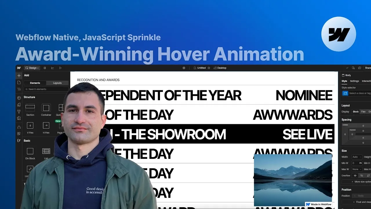
You can build a dynamic, image-stacking hover animation in Webflow — the kind you see on award-winning agency sites — almost entirely with native interactions, plus a dozen lines of JavaScript for the one thing Webflow can’t do alone. Hover a row in a list and a preview image scales up in the corner; move down the list and each new image stacks on top of the last, while the row’s text slides to reveal a black-on-white variant underneath.
It looks fancy, and it is — but it’s really a stack of small, honest decisions. A CMS collection so the whole thing is content-driven. A clever three-wrapper layout so the text reveal reads correctly no matter which direction your cursor comes from. And a tiny script that borrows Webflow’s own click interaction to fake something it has no native equivalent for.
The build is worth following start to finish, because the interesting part isn’t any single step — it’s why the naive version fails and what each fix is actually solving.
How it works
Content first. The list is a CMS collection (“recognitions and awards”) with a handful of fields — an award category, the recognition type, some link CTA text, and a project thumbnail. Building it CMS-driven means the layout stays flexible: you style one collection item and every row inherits it.
The direction problem. The reveal has to feel right whether you enter a row from the top or the bottom. But Webflow’s hover interaction can’t tell you which edge the cursor crossed — a single hover animation would always slide the same way. Two fixes combine here. First, the text is built as three stacked wrappers (white, black, white) inside a row that’s exactly one wrapper tall with overflow: hidden, so only one shows at a time and there’s always a hidden neighbor to slide into view. Second, the row is split into two half-height, absolutely-positioned trigger divs — a top one and a bottom one — each with its own hover interaction. Now “enter from the top” and “enter from the bottom” are genuinely different events, and each plays the correct slide.
The image problem. A row with overflow: hidden would clip its own thumbnail, so each image is set to position: fixed — which lifts it out of the row’s context and pins it to the viewport corner instead — with pointer-events: none so it never blocks the rows underneath. Native interactions can scale one image from 0 to 1 on hover, and honestly you could stop there and ship a great result. But the reference does two things Webflow can’t: it stacks a new image on top each time (regardless of DOM order, so later rows don’t always win the z-index), and it can alternate between two images per row.
Where the code earns its keep. The workaround is elegant. Webflow’s click interaction fires a different animation on the first click versus the second — a free two-state toggle. So you wire two images and two click animations, then let a short script translate every hover into a click and raise the shown image’s z-index. Webflow still runs all the animation; the JavaScript only does the counting and the stacking it has no native hook for.
How to use it
-
Create the CMS collection. Add a collection (e.g. Recognitions & Awards) with an option field for the award category, an option field for the recognition (nominee / awarded), a plain-text field for the link CTA copy, and an image field for the project thumbnail. Generate a few sample items to design against.
-
Lay out the row. Add a collection list inside your section wrapper and bind it to the collection. On the collection item, set a bold display type (the tutorial uses
font-size: 5.5vw,line-height: 1, all-caps) andposition: relative— it’ll anchor absolutely-positioned children later. Inside, add a link block set todisplay: blockand a customcolor: inheritproperty to kill the default link blue. -
Build the three text wrappers. Inside the link block, add a text wrapper with
1vwpadding on all sides anddisplay: flex/justify-content: space-betweenholding two text elements (category + recognition). Duplicate it twice; give the middle copy a combo class with white text on a black background. This stacked white / black / white order is what makes the reveal work in both directions. -
Clip the row to one line. Compute one wrapper’s height (top + bottom padding + text height — here
1 + 1 + 5.5 = 7.5vw), set that as the item’s fixed height, and setoverflow: hidden. Now only one wrapper shows and the others are clipped out of sight. -
Add the fixed preview image. Drop an image inside the link block, bind it to the thumbnail field, and set
position: fixed, anchored bottom-right with1vwoffsets,width: 30vw, a landscape aspect ratio,object-fit: cover,pointer-events: none, and a highz-index(e.g. 1000). -
Split the row into two triggers. Add two absolutely-positioned div blocks inside the link block, each
height: 50%, one pinned to the top half and one to the bottom. These are your direction-aware hover targets. -
Wire the direction-aware text animation. On the top trigger, add a Mouse-hover interaction. On hover, move the first text wrapper from
-200%(initial state) to-100%on the Y axis,0.7s, ease-out-quart; on hover-out, send it to-200%. Reuse that same “trigger on hover” animation for the bottom trigger, and give the bottom trigger its own hover-out that returns the wrapper to0%— the opposite motion. This is the four-direction behavior, done with one shared animation and two hover-out variants. -
Scale the image on hover. Add a hover interaction to the list item that scales the bound image from
0to1(0.7s, ease-out-quart) on hover, and back to0on hover-out. At this point you have a fully no-code version that already looks great. -
Prepare two images and a hidden trigger (for the JS version). To stack and alternate images, duplicate the image and give the two copies distinct combo classes. Add a tiny
1pxabsolutely-positioned div (the “images trigger”) and build a click interaction on it: the first click scales image one in (with a zero-duration reset action first), the second click scales image two in. Tag the collection item and this trigger with custom attributes —fc-award-hover="item"on the collection item andfc-award-hover="trigger"on the hidden trigger — so the script can find them. -
Add the small script. In Page settings → Before </body>, add this — it collects every item by its attribute, keeps a rising z-index counter, and on each
mouseenterclicks the hidden trigger (firing the click animation Webflow already defined) then raises the just-shown image’s z-index so it stacks above the rest:<script> const items = Array.from(document.querySelectorAll('[fc-award-hover = item]')) let z = 1000 for (const item of items) { item.images = item.querySelectorAll('img') item.hoverCount = 0 item.addEventListener('mouseenter', function () { const trigger = item.querySelector('[fc-award-hover = trigger]') trigger.click() item.images[item.hoverCount % 2].style.zIndex = z++ item.hoverCount++ }) } </script>The alternation is just
hoverCount % 2— even hovers light up the first image, odd ones the second — andz++guarantees the newest preview always wins, regardless of DOM order. Optionally, add alist-on-hover-outinteraction on the collection list that scales the images back to0when the cursor leaves the whole list.