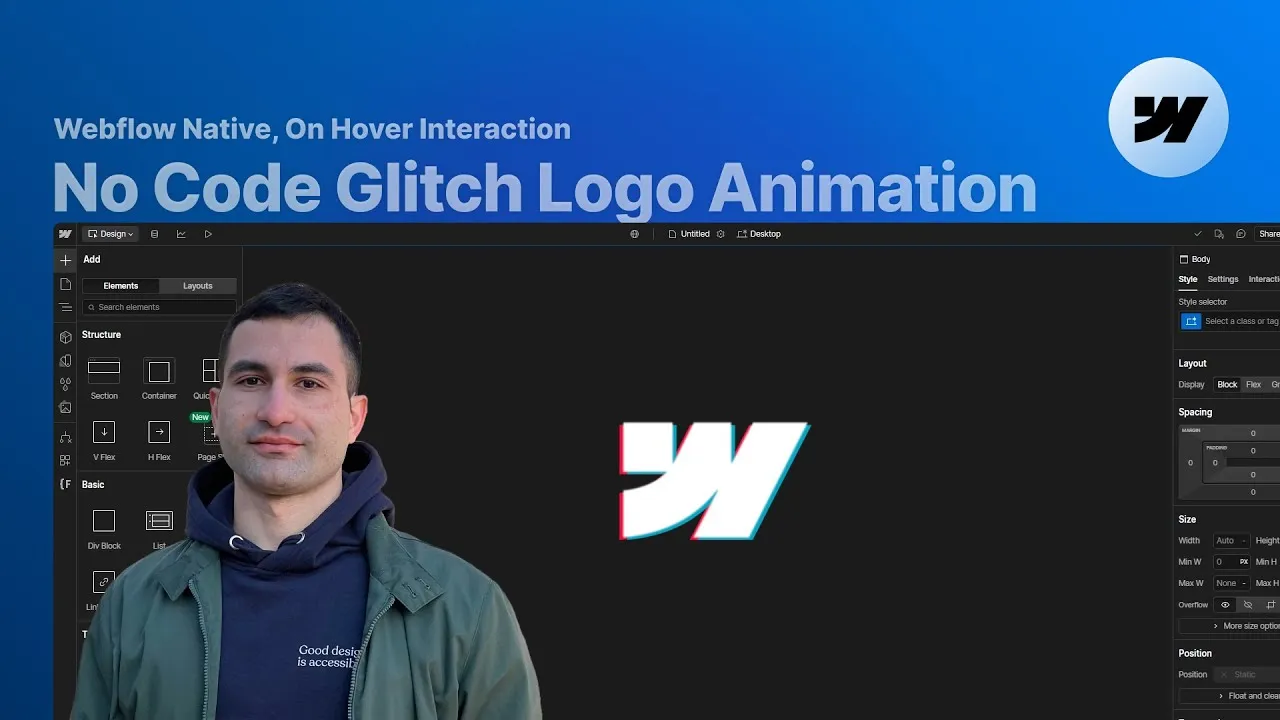
You’ve seen those chromatic glitch effects on logos — the ones where the letters briefly split into red and blue ghosts, like a signal breaking up. This lesson builds exactly that in Webflow, as a hover effect for your brand logo, with no custom code at all. Just stacked layers, a couple of CSS filters, and one native interaction.
The trick isn’t complicated once you see the setup behind it. Everything hangs on three copies of the same logo and the idea that a “glitch” is really just two hidden color layers flashing slightly out of alignment. Get the structure right and the animation is almost mechanical to build.
It’s a perfect touch for the logo in your navbar’s brand link — subtle when still, alive the moment someone hovers.
How it works
The layout. The heart of the build is the logo wrapper — in a real site this is the brand link inside your navbar. It’s set to position: relative because it holds a few absolutely-positioned images inside it. Nested in it are three logo image elements, sharing one base class (height 100%, cursor pointer) and each carrying its own combo class: layer 0, layer 1, and layer 2.
The three layers. layer 0 is the foreground — the crisp copy you actually read. It’s set to position: relative so it sits on top of the other two. layer 1 and layer 2 are position: absolute, so they stack perfectly behind the foreground instead of pushing it around. What makes them different is a set of CSS filters that tint one red and the other blue. There’s no formula behind the numbers — they come from experimenting in Webflow’s filter panel until the color reads right — but for the record, here are the exact stacks from the cloneable:
| Layer | Invert | Sepia | Saturate | Hue rotate | Brightness | Contrast |
|---|---|---|---|---|---|---|
Red (layer 1) | 48% | 83% | 4695% | 329deg | 84% | 107% |
Blue (layer 2) | 55% | 80% | 301% | 148deg | 93% | 91% |
The idea behind the motion. On hover you briefly reveal the two deeper color layers and jerk them around in small, random-looking steps, while the white foreground gets a tiny blur. Because the moves are extremely short and jump to small offsets, they don’t glide — they stutter. That stutter is the glitch. When it ends, both color layers are hidden again and the logo snaps back to crisp and still.
How to use it
-
Set up the wrapper and layers. Give the logo wrapper
position: relative. Inside it place three copies of the logo sharing a base class (height 100%, cursor pointer). Add a combo class to each:layer 0(position: relative, on top),layer 1andlayer 2(position: absolute). Tintlayer 1andlayer 2with the CSS filter values from the table above (or experiment until one reads red and the other blue). For a color-flexible logo, embed the foreground as an SVG withfill: currentColor. -
Create the interaction. In the interactions panel add a Mouse hover interaction on the logo wrapper. You only need the on hover state → Start an animation → create a new one, e.g. “Logo glitch animation”.
-
Set the initial state. Add a hide/show action on
layer 1, set display to Hidden, and mark it as initial state. Do the same forlayer 2. For the foreground (layer 0), add a filter action with a blur of 0 and mark it as initial state. -
Animate the red layer (
layer 1). Add a hide/show action to set its display to block, then add five move actions, each with duration 0.06s and easing ease, stepping through these X/Y offsets:(2.5%, -5%),(-2.5%, 2.5%),(-2.5%, -2.5%),(-2.5%, 2.5%),(0%, 0%). Then select all five moves, duplicate them, drag the copies right after the last move, and set their timing to after previous action so the stutter plays twice. Finish with a hide/show action setting display back to none. -
Animate the blue layer (
layer 2). Add a hide/show to set display to block, then five move actions (duration 0.06s, easing ease) dragged onto the first five keyframes, with offsets:(-5%, 7.5%),(-2.5%, -2.5%),(2.5%, 5%),(2.5%, 2.5%),(0%, 0%). Duplicate each one and drop the copies onto the matching later keyframes, then add a final hide/show to hide the layer again. -
Add the foreground blur touch. Select
layer 0, add a blur filter action on the first keyframe (duration 0.06s, easing ease, blur 1px), then duplicate it onto the last keyframe with blur back to 0px. This soft flicker on the white layer makes the whole thing feel more alive. -
Save, preview, reuse. Hit save and preview the hover. To confirm it’s color-agnostic, apply the same animation to a second logo and change the wrapper’s font color — thanks to
fill: currentColorit glitches just as well in any color, though white logos tend to look the sharpest.