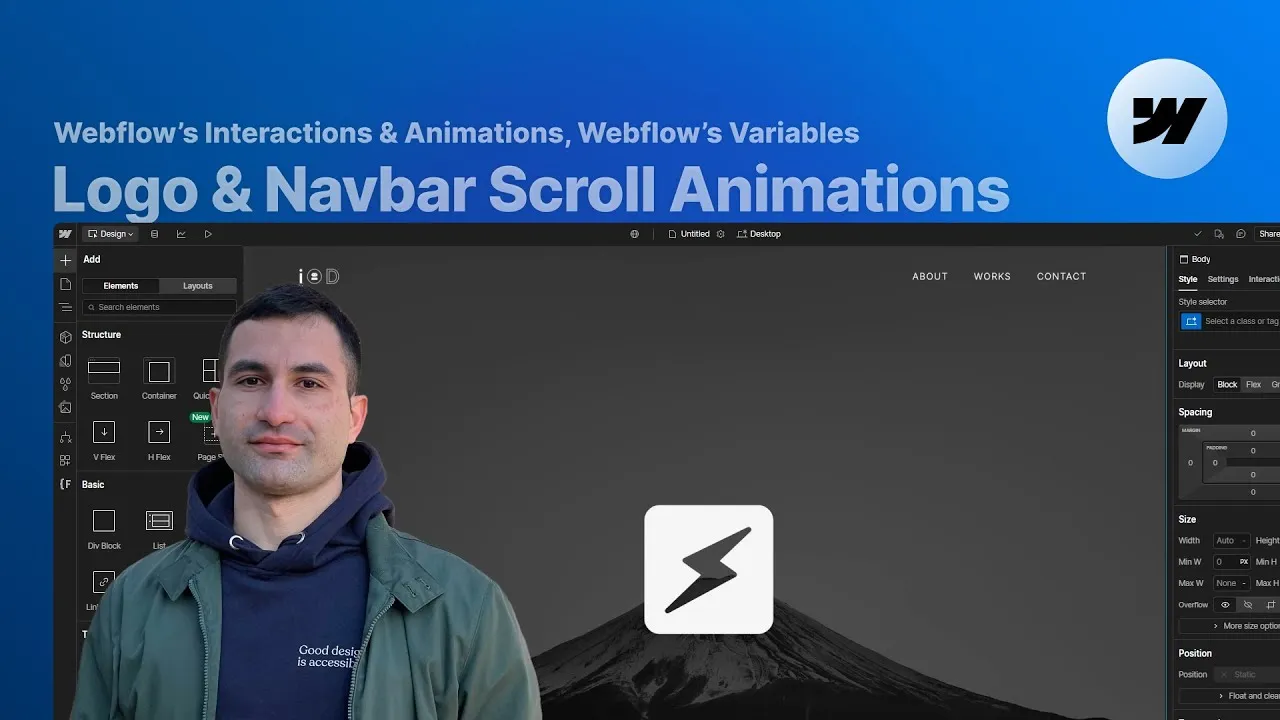
You can build scroll animations in Webflow where a logo, a 3D model, or a line of text sits centered on screen, then gracefully shrinks and glides into the navbar as you scroll — all without a single line of code. This lesson walks through four versions of that effect, using Webflow’s native while-scrolling interactions and variables.
Here’s the part that makes it easy: it isn’t four different techniques. It’s one technique with the animated element swapped out. Once you see the skeleton underneath, you can drop almost anything into it and get the same graceful landing.
How it works
The skeleton. Everything lives inside a hero section frame set to a height of 200 VH — think of that frame as the scroll track. Inside it, the hero section is 100 VH and set to stick to the top of the viewport while you scroll. On top of it sits the big logo wrapper: display flex, aligned to center, position: relative, and 100 VH tall so it fills the viewport. Finally, the navbar is position: absolute (pinned to the top, so it doesn’t take up space in the flow) with its height set in VH — 9 VH here. That VH-in-everything choice matters, because Webflow can’t animate an element between two different units. Height in VH for the logo, its wrapper, and the navbar means every value stays interchangeable and the math for centering just works, at any screen size.
The animation and its boundaries. A single while scrolling in view interaction on the hero section frame drives the whole thing. Its boundaries are what make it feel right: it starts when the element is fully visible (choosing “starts entering” would begin the animation mid-timeline, because that fires the instant the element touches the viewport), and it ends at “is fully invisible” with a 50% offset. Smoothing is set to 60% — enough to feel fluid without lagging behind your scroll. The animation itself is just a few actions: shrink the big logo wrapper from 100 VH to 9 VH, and shrink whatever sits inside it. The crucial number is that final 9 VH — it has to equal the navbar’s height, or the centered element lands above or below the navbar’s center line and the layout breaks.
Four variants, one setup. Only the animated child changes between examples. (1) A logo embed: animate its height from 20 VH to 5 VH. (2) A full-screen Spline 3D model: give it a 16:9 aspect ratio so it scales cleanly, then animate its size from 100% to 90% of its container instead of a height. (3) Centered text: link its font size to a variable in VW units (so it scales with viewport width), then animate that variable from 13 VW to 4 VW. (4) Bottom-aligned full-width text: the wrapper is aligned to the bottom, so re-centering takes two moves — shift the text wrapper up by half its parent’s height to bring its bottom onto the navbar’s center, then shift the text down by half its own height (2 VW, because the final font size is 4 VW with a line-height of 1, so the text is 4 VW tall).
Variables are the real power. Because you can animate a variable and link that variable to a style property, the interaction can drive CSS you normally can’t touch directly. Here, a percentage variable is linked to the navbar’s left and right padding, then animated so the navbar’s horizontal padding grows as you scroll. A fancier version also animates the navbar’s height from 11 VH down to 9 VH and applies an invert filter to darken the logo.
Why the 50% offset. The hero frame’s 200 VH is the animation’s runway; the offset decides where it finishes. You want the animation to end once the last 100 VH of the frame is fully in view (before the next section starts entering). The ratio of that portion to the whole frame is 100 ÷ 200 = 0.5, hence the 50% offset. If you want it to wrap up a touch earlier, nudge the offset to around 55%, or move the final timeline actions from 100% back to roughly 90–95%.
How to use it
-
Build the track. Create a hero section frame at 200 VH. Inside it, add a hero section at 100 VH set to stick to the top of the viewport while scrolling. (An absolutely-positioned background wrapper with a full-cover image at ~30% opacity is optional polish.)
-
Center the element. Inside the hero section, add the big logo wrapper:
display: flex, align center,position: relative, height 100 VH. Drop your logo (or model, or text) inside it. For an image logo, size it with VH so it scales with the viewport. -
Set up the navbar. Make the navbar
position: absolute, pinned to the top,display: flex, with its height in VH (e.g. 9 VH). Using VH here is what lets the logo land exactly centered later. -
Add the interaction. On the hero section frame, add a while scrolling in view animation. Set the start to element is fully visible and the end to is fully invisible with a 50% offset. Set smoothing to about 60%.
-
Animate the shrink. In the timeline, animate the big logo wrapper’s height from 100 VH to 9 VH (matching the navbar). Then animate the inner element — the logo’s height (e.g. 20 VH → 5 VH), a Spline’s size (100% → 90%), or a text’s font-size variable (13 VW → 4 VW).
-
For bottom-aligned text, align the wrapper to the bottom, then re-center with two offset moves: the wrapper up by half its parent’s height, and the text down by half its own height (2 VW for a 4 VW font at line-height 1).
-
Drive extra properties with a variable. Create a percentage variable, link it to the navbar’s left and right padding in the style panel (click the purple dot to bind it), then add two variable actions to the timeline — one at the start value, one at the end — so the padding animates as you scroll. If the padding doesn’t update, edit the first action’s value, then set it back; Webflow sometimes needs the nudge to register it.
-
Tune the feel. Taller hero frame = slower animation. To finish slightly before the next section appears, raise the offset toward 55% or pull the last actions back to ~90–95% on the timeline. Add a mobile-portrait version of the interaction with adjusted initial/final heights for responsiveness.