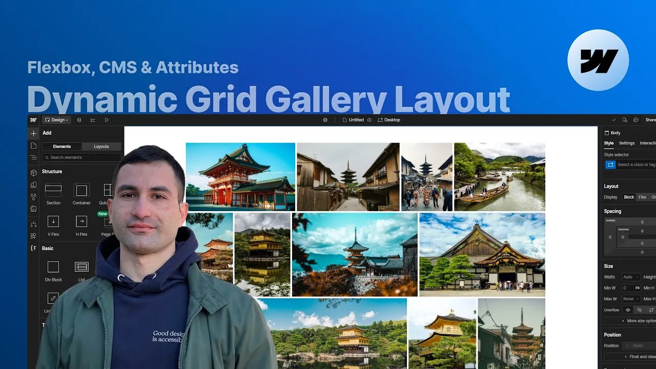
You can build a dynamic, CMS-driven grid gallery in Webflow where every image keeps its exact aspect ratio — no cropping, no object-fit: cover, nothing cut off at the edges. Point it at a CMS collection (or just a handful of static images), tell it how many columns you want at each breakpoint, and the layout works out the rest.
The trick most tutorials reach for — object-fit: cover — trims your images to fit the grid. That’s fine for thumbnails, but it’s the wrong move for a real gallery, where every detail of the work is the whole point. This solution sizes each image by its own proportions instead, so a wide landscape shot and a tall portrait can share the same row and both stay perfectly intact.
It’s an attributes-only component: the code is already written and ships with the cloneable, so all you do is drop a few attributes on the right elements. It works with CMS or static images, with plain images or lightboxes, and you can run as many galleries as you like on a single page.
How it works
The math behind it. Take a row of, say, three images. For each one the script measures its aspect ratio (width ÷ height), then adds up all three. Each image gets a share of the row equal to its own ratio divided by that sum — a number smaller than one. Multiply that share by the space actually available (100% of the row minus the gaps between images) and you get a width that keeps the image’s proportions intact while the row stays perfectly filled. Wider images get wider columns, taller ones get narrower columns, automatically.
What you actually style. You don’t set the image widths yourself. In the Designer you give the gallery item a width of around 40–45% — purely so the items don’t pile on top of each other while you’re working — and the script overwrites it with the computed value once the page is live. Don’t go much below 40%, though: Webflow picks which responsive image size to generate from the width it sees in the Designer, so a tiny width makes it serve a small, pixelated file.
Columns per breakpoint. You declare the column count with columns-desktop, columns-tablet, columns-landscape and columns-portrait on the gallery wrapper. They cascade exactly like Webflow’s own styles: whatever you set for a larger breakpoint flows down to the smaller ones until one of them sets its own number. Set nothing at all and every breakpoint gets two columns.
The two edge cases it handles for you. First, the last row. When the images don’t divide evenly into your column count, a single leftover image has nothing to be sized against — so the code invents phantom images with the same aspect ratio (or, for two leftovers, the average of the two) and sizes the real ones as if the row were full. Second, the flicker: the widths can only be computed once every image has loaded, so there’s a brief flash on first paint. Cover it with a simple page-load fade on the gallery wrapper, and optionally a scroll-into-view animation on each item for a little life.
How to use it
-
Clone the project. The script, the attributes, and a working sample gallery all come in the Webflow cloneable linked below. Start there so the attribute names match the code out of the box.
-
Set up your content. For a CMS gallery, use a collection with a multi-image field and bind a collection list to it. For static images, a plain wrapper of images works just as well — nothing has to come from the CMS.
-
Mark the gallery wrapper. On the collection list (or the static wrapper), set
display: flex, directionrow, and a gap you like, then addfc-gallery="list". -
Mark each item. On the gallery item — the collection item, or each static image wrapper — add
fc-gallery="item", and give it a Designer width of about 40–45% so items don’t stack while you design. The script replaces that width on the live site. -
Handle lightboxes and images. If you use a lightbox, set its display to
block(it defaults to inline-block) so it fills the item, link each one to its image, and give them a shared group name so they browse together. Set the image itself todisplay: blockandwidth: 100%. -
Choose your columns. On the gallery wrapper, add
columns-desktop,columns-tablet,columns-landscapeand/orcolumns-portraitwith the counts you want. Remember they cascade down, and leaving them all off gives you two columns everywhere. -
Smooth the load (optional). Add a page-load interaction that fades the gallery wrapper from opacity 0 to 100% to hide the initial calculation flicker, and a scroll-into-view slide/fade on each item to make the grid feel alive.
-
Reuse it freely. Duplicate the gallery for a second layout with a different column setup, or drop more galleries on other pages — each one reads its own attributes independently.