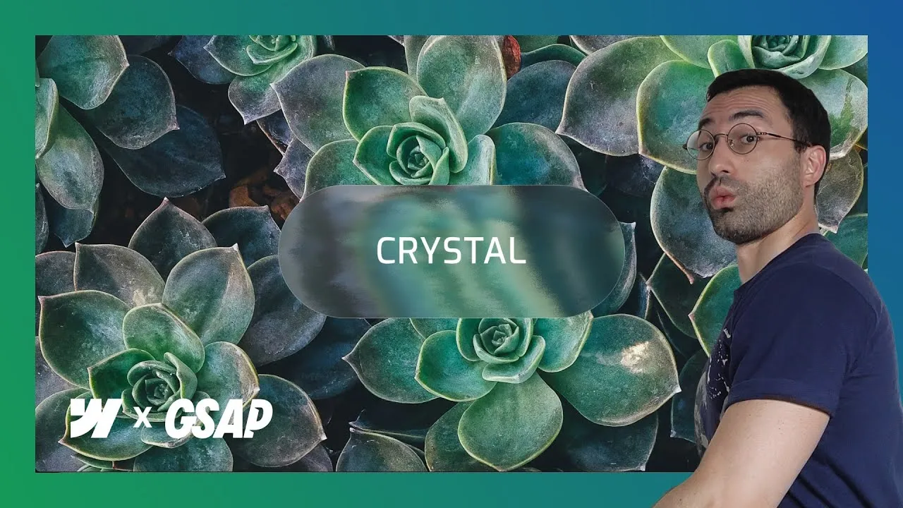
Build a glassy crystal button in Webflow that actually refracts the page behind it, then comes to life on hover — softening from frosted glass to crisp ice with a small nudge of GSAP. The trick isn’t a CSS blur; it’s a real SVG filter wired to the button through backdrop-filter, so whatever scrolls underneath bends and ripples through the glass.
What makes it worth the setup is how physical it feels. Because the filter reads the actual content behind the button, the effect changes as you scroll, and the hover animation gives it a tactile little lift. It looks like a lot of moving parts, but underneath it’s three SVG filter primitives, a few lines of JavaScript to feed it a texture, and a tiny GSAP timeline.
And none of it is locked to my class names. The script hooks onto an attribute, so you can name things however you like and still get the effect for free.
How it works
The glass look comes from an SVG filter, not a CSS blur. You paste the filter markup into an Embed element, give it display: none, and move it to the very top of the <body>. That placement matters: put the filter at the top so it’s global and always available — drop it lower and some browsers scope it locally or skip it, the same way a CSS variable belongs in :root. The filter carries id="glass", and the button references it with a custom property, backdrop-filter: url(#glass). That single line is the connection: the button grabs its filter source from the element with that ID.
<!-- Embed at the very top of the body, display: none -->
<svg>
  <filter id="glass"
          x="-1" y="-1" width="3" height="3"
          filterUnits="objectBoundingBox"
          primitiveUnits="objectBoundingBox">
    <feImage x="-0.5" y="-0.5" width="2" height="2"
             preserveAspectRatio="none"
             result="map" />
    <feGaussianBlur in="SourceGraphic" stdDeviation="0.02" result="blur"/>
    <feDisplacementMap in="blur" in2="map"
                       scale="0.8" xChannelSelector="R" yChannelSelector="G"/>
  </filter>
</svg>
Inside it, three primitives do the work. feImage loads the displacement map — a texture that acts like a topographic map, where lighter and darker areas tell the filter how far to push or pull each pixel — and outputs a result the rest of the chain can read. feGaussianBlur softens the button first; its stdDeviation controls how sharp or cloudy the glass looks. Then the star, feDisplacementMap, takes the blurred button and the map together and shifts the pixels — its scale is the intensity dial. The filter region is deliberately oversized (x="-1" y="-1" width="3" height="3") so nothing clips at the edges.
The detail that makes those numbers make sense is primitiveUnits="objectBoundingBox": every value inside the filter is a fraction of the button’s own box, not a pixel count. That’s why stdDeviation="0.02" and scale="0.8" look tiny but hit hard — 0.8 means the displacement can shove a pixel by most of the button’s width. It also means the effect scales automatically with the button instead of needing different numbers for a small and a large one. Push scale past ~1.4 and the glass reads as shattered rather than refracted.
Notice too that feImage has no href in the markup — that’s deliberate, and it’s the one thing the markup alone can’t do. The displacement map is an external image, so a short script fetches it and feeds it in. Without that, the filter knows it should distort but has no texture to distort with:
<!-- Embed at the bottom of the body: load the map + clone the filter per button -->
<script>
  document.addEventListener('DOMContentLoaded', async () => {
    // ===== 1) LOAD DISPLACEMENT MAP INTO <feImage> ===================
    const MAP_URL = "https://essykings.github.io/JavaScript/map.png"

    const template = document.getElementById('glass')
    const feImage  = template?.querySelector('feImage')
    const btns     = document.querySelectorAll('[fc-glass-button]')

    if (!template || !feImage) {
      console.warn("[glass] Filter template or <feImage> not found. Ensure #glass is in the DOM.")
      return
    }
    if (!btns.length) return // no buttons on page

    try {
      // Fetch the map image, convert to blob, and set it as <feImage> source
      const res    = await fetch(MAP_URL)
      const blob   = await res.blob()
      const objURL = URL.createObjectURL(blob)

      // SVG2 prefers `href`; some browsers still look for `xlink:href`
      feImage.setAttribute('href', objURL)
      feImage.setAttributeNS('http://www.w3.org/1999/xlink', 'xlink:href', objURL)

      // Keep a global reference to reuse in clones
      window.__glassMapHref = objURL
      // Revoke only when the page is closed
      window.addEventListener('beforeunload', () => URL.revokeObjectURL(objURL))
    } catch (err) {
      console.error("[glass] Failed to load displacement map:", err)
    }

    // ===== 1b) CLONE THE FILTER FOR EACH BUTTON ======================
    // Store references to <feGaussianBlur> and <feDisplacementMap> per button
    const mapHref =
      feImage.getAttribute('href') ||
      feImage.getAttributeNS('http://www.w3.org/1999/xlink','href') ||
      (feImage.href && feImage.href.baseVal) ||
      window.__glassMapHref || null

    const glassNodes = new WeakMap()
    btns.forEach((btn, i) => {
      const clone = template.cloneNode(true)
      const id = `glass-${i+1}`
      clone.id = id
      template.parentNode.appendChild(clone)

      // Ensure the cloned filter points to the same displacement map
      const img = clone.querySelector('feImage')
      if (mapHref && img) {
        img.setAttribute('href', mapHref)
        img.setAttributeNS('http://www.w3.org/1999/xlink','xlink:href', mapHref)
      }

      // Apply this unique filter to the button via backdrop-filter
      btn.style.backdropFilter = `url(#${id})`

      // Save blur + displacement nodes for this button
      glassNodes.set(btn, {
        blur: clone.querySelector('feGaussianBlur'),
        disp: clone.querySelector('feDisplacementMap')
      })
    })

    // Expose references globally for the second script
    window.__glassNodes = glassNodes
    document.dispatchEvent(new CustomEvent('glass:filters-ready'))
  })
</script>
That script does more than load an image, and the extra part is what makes multiple buttons possible. A single filter animated by two buttons would fight itself — hovering one would warp both — so the script clones the filter per button, gives each clone its own id (glass-1, glass-2, …), and repoints that button’s backdrop-filter at its own copy. The url(#glass) you set by hand in Webflow is really the Designer-time preview; on the live page the script quietly swaps it for the clone. It keeps the blur and displacement nodes of each clone in a WeakMap and fires a glass:filters-ready event when it’s done, which is how the animation script knows what to grab. Crucially, it finds buttons by the fc-glass-button attribute (present, no value needed), not by a class, so your naming convention is completely irrelevant.
The hover comes last, and it’s GSAP:
<!-- Embed at the bottom of the body: hover animation (glass -> ice) -->
<script>
  document.addEventListener('DOMContentLoaded', () => {
    // ===== 2) HOVER ANIMATION (GLASS -> ICE) =========================
    // Edit only these constants to change the feel of the effect
    const HOVER_SCALE        = 1.40  // on-hover displacement intensity
    const HOVER_TRANSF_SCALE = 1.015 // scale transform applied to the button
    const HOVER_BLUR         = 0.00  // on-hover softness (lower = sharper/ice-like)
    const DURATION           = 0.30  // animation duration (0.2–0.4)
    const EASE               = 'power1.out' // GSAP easing

    const btns = document.querySelectorAll('[fc-glass-button]')
    if (!btns.length) return

    const setup = () => {
      const map = window.__glassNodes
      if (!map) return false

      btns.forEach((btn) => {
        const nodes = map.get(btn)
        if (!nodes?.blur || !nodes?.disp) return

        const { blur, disp } = nodes

        // Build a per-button timeline
        const tl = gsap.timeline({ paused: true, defaults: { duration: DURATION, ease: EASE }})
          .to(disp, { attr: { scale: HOVER_SCALE } }, 0)       // stronger displacement
          .to(blur, { attr: { stdDeviation: HOVER_BLUR } }, 0) // less blur = icy/crisp
          .to(btn,  { y: -1, scale: HOVER_TRANSF_SCALE }, 0)   // tiny physical feedback

        // Pointer + keyboard accessibility
        btn.addEventListener('pointerenter', () => tl.play())
        btn.addEventListener('pointerleave', () => tl.reverse())
        btn.addEventListener('focus',        () => tl.play())
        btn.addEventListener('blur',         () => tl.reverse())
      })
      return true
    }

    // Run immediately if filters are ready, otherwise wait for event
    if (!setup()) {
      document.addEventListener('glass:filters-ready', setup, { once: true })
    }
  })
</script>
A tiny timeline animates the displacement and blur from the resting “soft glass” state to a “crisp ice” state, nudging the button up 1px and scaling it slightly for tactile feedback. Note the direction of travel: displacement goes up (0.8 → HOVER_SCALE 1.40) while blur goes down (0.02 → HOVER_BLUR 0) — more distortion, less haze, which is exactly what reads as glass hardening into ice. You tune it with the five constants at the top: HOVER_SCALE (~1.05–1.25 for a classy ripple, 1.40+ for jagged broken-crystal edges), HOVER_TRANSF_SCALE (keep it modest — 1.015 is already noticeable), HOVER_BLUR (0 for crisp, ~0.03 for a softer landing), DURATION (0.2s snappy, 0.4s elegant), and EASE (e.g. power1.out, power2.out, expo.out). The same animation runs on keyboard focus and reverses on blur, so keyboard users get the exact same experience — the effect stays accessible, not mouse-only.
How to use it
-
Clone the project. Grab the Webflow cloneable — it ships with the button, the SVG filter markup, the displacement-map loader, and the GSAP hover snippet, all commented.
-
Give the button contrast to refract. The effect only shines when there’s content behind it. In the demo the button sits
fixedand centered while a full-width background image scrolls underneath, so you can watch the filter change with the page. Any rich, scrollable background works. -
Style the glass base. Make the button background transparent with a subtle white linear gradient (roughly
135deg, white at ~20% → ~8% → ~3% opacity), a pillborder-radius, and a 1px white border at ~30% opacity. This frosted base is what the filter refracts — tweak or drop it freely; it changes the look, not the filter. -
Add the filter. Paste the filter markup above into an Embed, set it to
display: none, and move that Embed to the top of the body. It hasid="glass". -
Link the filter to the button. On the button, add the custom property
backdrop-filterwith the valueurl(#glass). You’ll see a rough glass effect appear immediately. -
Load the displacement map. Paste the loader script into a second Embed (
display: none), placed at the bottom of the body. It feeds the map image into the filter so it has texture to bend, then clones the filter once per button. The map is fetched from an external URL (MAP_URLat the top of the script) — swap it for your own hosted copy if you’d rather not depend on someone else’s server. -
Tag the button. Add the attribute
fc-glass-buttonto your button — no value needed — so the script can find it regardless of its class name. -
Add the hover and turn on GSAP. Paste the GSAP snippet, then flip GSAP on in your project settings — the code does nothing until the library loads. Tweak
HOVER_SCALE,HOVER_BLUR,DURATION, andEASEto taste. -
Reuse it. For several buttons on one page, duplicate the button — the loader already gives each one its own cloned filter, so they animate independently. For other pages, turn the filter and script into components (edits then propagate everywhere), or place the script alone in the site-wide footer code and drop a button wherever you need it.