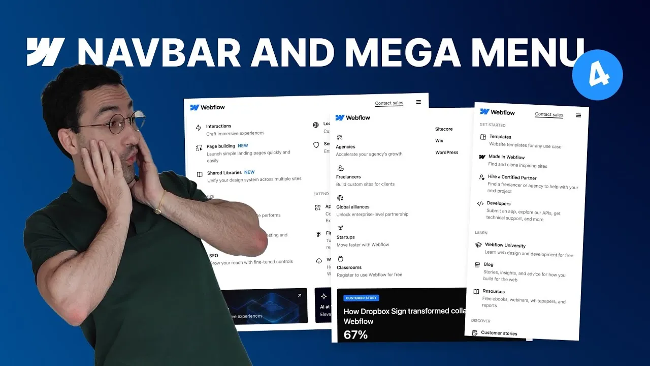
By the end of this lesson the three desktop mega menus from Part 3 work cleanly on every breakpoint — tablet, landscape, and portrait — layout, scrolling, and hover states included. It’s the trickiest episode in the series, so we take it one breakpoint at a time and stay methodical.
The theme is that a mega menu behaves completely differently on mobile: instead of floating below the navbar, it lives inside the open mobile menu. Understanding that one shift explains almost every fix here — why panels vanish, why they need to scroll, and why columns have to collapse.
How it works
The positioning flip. On desktop, each dropdown list is position: absolute with top: 100% so the panel floats below the navbar. On mobile, the nav menu itself becomes position: absolute (pinned below the navbar), which turns it into the new reference point — so the old top: 100% shoves each panel below the full-height menu and off-screen. The fix is to set the dropdown lists back to position: static: now each panel sits inline, right under its toggle, exactly where a mobile accordion should be.
Make it scroll. An open mega menu can easily be taller than the viewport, and by default the overflow is just hidden — trapping content. Give the nav menu’s inner wrapper overflow: auto and the whole menu scrolls when it needs to.
Collapse columns with calc(). Rather than switching the container to a grid, keep the changes on the children: set each column to shrink if needed and a width of calc(50% - gap/2) for two-up (or 100% for one-up on portrait). The - gap/2 matters — without accounting for the flex gap, two “50%” columns won’t fit on one row.
Mind the shared classes. Buttons and banners reuse the regular link’s base class. So when you switch the links to a column direction, the buttons’ arrows move too. The reliable fix is to temporarily remove the button’s background combo class, correct the direction on the shared class, then reapply the variant. The same shared-inheritance idea works for you at the end: fixing hover states once on the base classes cascades down to landscape and portrait automatically.
How to use it
- Tablet — reposition. Set the nav menu to
position: absolute,top: 100%(it sits below the navbar). Set everynavbar_dropdown-listback toposition: staticso panels appear inline. Give the nav menu inner wrapperoverflow: autoto scroll. - Tablet — collapse to two columns. On the columns, set
shrink if neededand widthcalc(50% - <halfGap>). Even out the panel padding, drop the column right-borders, and switch the bottom link content wrapper from row to column. - Tablet — per-menu tweaks. For Solutions, clear the
cc-smallmax-width and useorder: laston the narrow column so the banner balances the layout. Resources needs nothing. - Landscape — trim. Remove the panel’s top/bottom padding and box-shadows, tighten padding to match the toggle, and stack the CTA buttons full-width (inner CTA list row → column) — then fix the arrow via the combo-class toggle trick. Give the banner column a
cc-landscapecombo set to full width. - Portrait — one column. Zero the brand link’s default left padding, even out the toggle padding, set columns to
width: 100%, switch links back to row (icon beside title), and tidy the button gap. - Remove hover. In the dropdowns, set link hover color back to dark, and set button/banner hover to white with opacity back to 100% (toggle the single-button combo class to edit the shared style). Inheritance carries these fixes down to landscape and portrait.
That completes a robust, fully responsive navbar and mega menu that mirrors Webflow’s own — structure, accessibility, fluid spacing, and mobile behavior all handled.