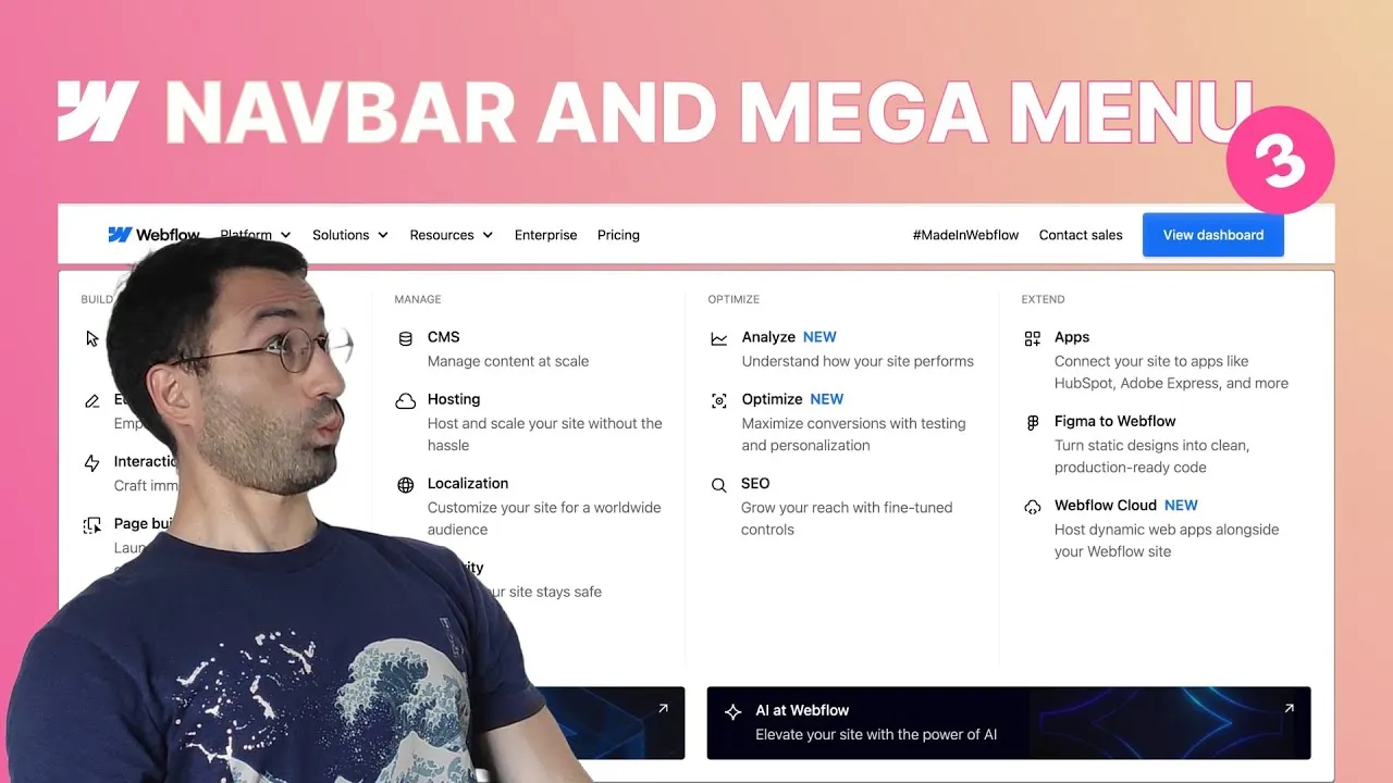
By the end of this lesson you’ll have turned three plain dropdowns into full, accessible mega menus — columns of links, banners, CTAs, and proper aria labels — just like the panels on Webflow’s own site. This is the structural heart of the series; animation comes later.
The lesson is built around a few “aha” moments. The biggest is how to make a dropdown panel stretch edge to edge without hacking widths. The second is treating the whole menu as a semantic list so it’s genuinely accessible, not just good-looking. And once one menu is built, the other two are mostly copy, delete, and swap.
How it works
Full-width panels, the clean way. Webflow’s mega menu panel spans the entire viewport while its content aligns to the navbar’s container. The naive fix — width: 100vw — overflows on Windows because the scrollbar eats into 100vw (you’d need 100dvw). But the real problem is alignment: the dropdown list positions itself against the nearest ancestor with position: relative, which by default is the dropdown wrapper, not the navbar. The elegant fix is to set every ancestor (dropdown, nav menu, content wrapper, main container) to position: static, leaving only the navbar as relative. Since the navbar is already full-width, the panel now stretches perfectly edge to edge — no width hack needed.
Structure = accessibility. The mega menu isn’t a pile of divs; it’s nested unordered lists. The outer list’s items are the columns; each column holds a title plus an inner list of link items (icon + name + optional “new” label + description). Screen readers understand lists, so this structure is what makes the menu navigable. You then layer meaning on top with aria-label: each inner list gets a group name (Build, Manage, Optimize, Extend…) and the whole menu gets its own (Platform, Solutions, Resources), so assistive tech announces the same structure sighted users see.
One structure, three menus. Build Platform fully — four columns plus a wrapping CTA row (two image buttons on a second full-width row, achieved with flex-wrap + grow if possible on the columns and a width: 100% CTA column set to shrink if needed). Then copy the whole dropdown-list-container into Resources (delete the CTA row) and Solutions (three columns, one a promotional banner variant, narrower via a cc-small combo).
The gotchas that bite everyone. Text inside the panel inherits the navbar’s hover color, so it turns gray when you hover the navbar — fix it by setting the dropdown list’s color explicitly to dark instead of inherit. And inline SVGs need two things to behave: fill="currentColor" on the path (so they follow text color) and a viewBox on the svg tag (so they actually scale when resized).
How to use it
- Make the panel full-width. Class the dropdown list
navbar_dropdown-list. Set the dropdown, nav menu, content wrapper, and main container toposition: staticso the navbar becomes the reference; the panel now spans the viewport. - Add the aligned inner container. Inside the list, add
navbar_dropdown-list-containerwithmax-width: 90rem, auto side margins, and the sameclamp()horizontal padding as the main container, so content lines up with the navbar. - Style the panel. Dropdown list: transparent background with a small top padding (the gap under the navbar). Content wrapper: white background, rounded corners, and four layered box-shadows (e.g.
0 20px 40px,0 10px 18px,0 4px 8px,0 1px 2px). - Build accessible lists. Make the content wrapper an unordered list (no bullets, no margins). Each column is a list item (
navbar_dropdown-list-column) with a title and an inner list of link items. Lay the columns out with Flexbox and a gap. - Build one link item. Link block = icon (SVG embed,
fill="currentColor",viewBox) + a text wrapper (semibold name, optional inline “new” label, lighter description). Set the panel’s color explicitly to dark so navbar hover doesn’t bleed in. - Finish Platform. Add column right-borders (transparent on the last via
cc-last), then a second-row CTA column: enableflex-wrap, give the four columnsgrow if possible, and give the CTA columnwidth: 100%+shrink if neededso it wraps full-width. Add two image CTA buttons that split 50/50. - Reuse for Solutions & Resources. Copy the container into each; delete the CTA row for Resources; for Solutions use three columns (names-only middle column, a promotional banner in the third) and shrink the container with a
cc-smallcombo. - Add interactions. Transition link color (300ms ease-out) and turn links blue on hover; fade CTA/banner buttons to 90% opacity on hover; make sure an open dropdown’s toggle stays dark with its blue underline even while you hover other links.
- Label everything. Add
aria-labelto each inner list (the group name) and to each menu’s outer list (Platform / Solutions / Resources).
Three accessible mega menus, done. Next episode: making them fully responsive.