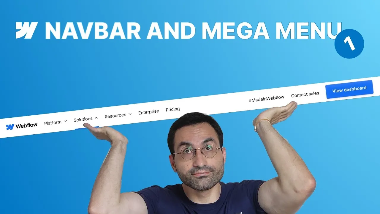
By the end of this lesson you’ll have rebuilt the desktop version of Webflow’s own navbar from a blank canvas — structure, layout, fluid spacing, and hover effects included. It’s the foundation of a full series that goes on to make it responsive, add a real mega menu, and animate the dropdowns.
We do this the right way: no mega menu and nothing responsive yet, just a rock-solid desktop structure. Get that right and everything after it — mobile, dropdowns, animations — snaps into place instead of fighting you. Along the way we cover proper accessibility, fluid sizing with clamp(), and a hover underline that doesn’t wreck your layout.
The reference is Webflow’s actual homepage navbar, so we inspect it as we go and mirror its structure and details.
How it works
The skeleton is familiar: a navbar element wrapping a main-container (max-width plus horizontal padding as a layout boundary) wrapping a navbar_content-wrapper set to display: flex with justify-content: space-between. That splits the bar into a left group (brand + primary links) and a right group (secondary links + CTA).
The most important decision is accessibility. Webflow’s nav menu carries the semantic nav tag, so every navigation link — including the right-side group and the CTA — belongs inside it, not scattered across sibling wrappers. Going one step further, the primary link group is really a list, so it reads best as an unordered list (list-style: none, items set to inline-block). This is the kind of structure screen-reader users rely on.
A subtle gotcha: padding goes on the dropdown toggle, not the dropdown. The toggle is the element that actually opens the menu, so if you pad the wrapper instead, the visible link looks big but only a narrow strip is clickable. Reset the dropdown’s padding to zero and pad the toggle.
For sizing, we go fully fluid with clamp(). Rather than fixed values, font sizes and gaps scale with the viewport between a min and a max. The preferred value comes from a proportion: our container maxes out at 90rem, so if 90rem corresponds to 100vw, then 1rem ≈ 1.11vw. Apply the same idea to the container padding and every gap and the navbar shrinks gracefully across the whole desktop range without wrapping.
Finally, hover effects that respect the layout. A real bottom border changes an element’s height and shoves the navbar around, so the underline is a transparent inset box-shadow (Y: -2px, blur: 0) whose color animates in on hover. And to mirror Webflow’s touch where the whole menu dims except the link you’re on, each link’s color is set to inherit: the nav menu’s hover state fades everything to gray, while each link’s own hover state keeps it dark.
How to use it
- Structure it. Add a navbar →
navbarclass (white background, a subtle 1px bottom border). Inside, anavbar_main-container(auto side margins,max-width: 90rem, horizontal padding). Inside that, anavbar_content-wrapperset todisplay: flex,space-between. - Add the content. Brand link with the logo (paste the SVG into a Code Embed), a nav menu with three dropdowns (Platform, Solutions, Resources) and two links (Enterprise, Pricing), plus a right group of two links and a CTA button.
- Make it accessible. Move every link inside the nav menu. Convert the primary group to an unordered list with
navbar_link-list-items; strip default list padding/margins and bullets; set items toinline-block. - Fix the dropdown hit area. Duplicate the dropdown class, reset its padding to zero, and move the vertical padding (
1.5rem) onto the toggle instead. Set the toggle todisplay: flex, center-aligned, with a smallgapfor the icon. - Lay it out.
display: flexon the link groups and nav menu; usegapfor spacing andgrow if possibleon the nav menu so it fills the space after the brand. Center everything vertically. - Style the CTA. Blue background,
border-radius: 4px, padding, medium weight, and the layered box-shadows copied from Webflow’s button. - Go fluid with clamp(). Replace fixed font sizes and gaps with
clamp(min, preferredVW, max)using the90rem = 100vwproportion, so nothing wraps as the viewport narrows. - Add hover polish. On the CTA, transition background + box-shadow and darken on hover. On links and toggles, add a transparent inset box-shadow underline that turns blue on hover; set link colors to
inheritso the menu fades to gray while the hovered item stays dark. Transition color too, so it animates.
That’s the desktop navbar — structured, accessible, fluid, and interactive. Next episode: making it fully responsive for mobile.