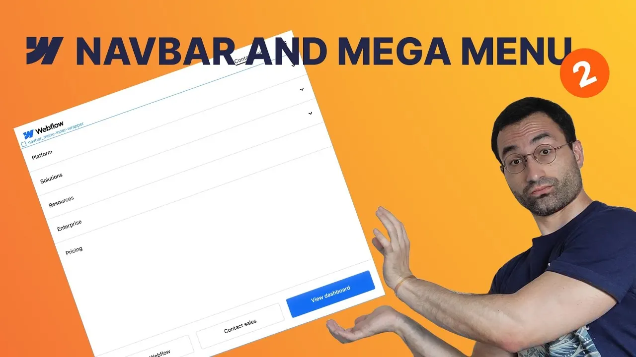
By the end of this lesson the static desktop navbar from Part 1 becomes a fully responsive navigation system that works across tablet, landscape, and portrait — mobile menu included. We debug the layout as we go and dig into the units and quirks that make mobile menus genuinely hard: vh vs dvh, Webflow’s open-state behavior, and flex wrapping.
Two problems are worth the whole lesson on their own. The first is the mobile height bug: a menu sized with 100vh gets clipped by the phone’s browser bars. The second is the “push a group to the bottom” trick that mysteriously stops working when the menu opens. Both have clean fixes once you understand what’s actually happening.
We finish with a professional touch: a few lines of CSS that lock page scroll while the menu is open, so nothing drifts in the background.
How it works
The mobile height bug is the headline. We want the open nav menu to fill the screen below the navbar, so the instinct is calc(100vh - navbarHeight). But 100vh measures the viewport ignoring the mobile browser’s address bar and bottom navigation bar, so before you scroll, the bottom of the menu hides behind them. The fix is dvh (dynamic viewport height): it tracks the actually-visible area and updates live as those bars appear and disappear. Switch the height to calc(100dvh - navbarHeight) and the menu is never clipped. (Watch for inherited values — if you duplicated the nav-menu class onto an inner wrapper, reset the height in the right place.)
The bottom-group trick needs a workaround. To pin the secondary button group to the bottom of the menu, you’d normally give it margin-top: auto in a flex column. But when the menu is open, Webflow forces the nav menu to display: block, so it isn’t a real flex container and the auto-margin has nothing to push against. The fix: wrap the menu’s contents in an inner div, move the flex layout (display: flex, direction, gap, sizing) onto that wrapper, and leave the outer nav menu just holding its size. Because adding a wrapper is a structural change, it hits every breakpoint — so you re-home the styles and double-check desktop still looks right.
Flex wrapping has a catch. Enabling flex-wrap seems to do nothing when the children are set to grow if possible, because they’d rather shrink than drop to a new line. Switch them to shrink if needed (or set explicit flex-grow values) and they wrap as expected — e.g. two buttons on one row, the CTA on the next.
Scroll lock is tiny. A few lines of CSS set the body to overflow: hidden while the menu is open, freezing the page behind it. No JavaScript. Put it in the site’s head custom code (so it applies everywhere) or, if the navbar is a component, in an embed inside the component. The whole rule is this — :has() checks whether the page contains an open menu button, and Webflow adds w--open to it automatically:
<style>
  body:has(.w-nav-button.w--open) {
    overflow: hidden
  }
</style>
How to use it
- Reposition the menu button. Give it a class and push it right with
margin-left: auto. Duplicate the “contact sales” link outside the menu, hide it on desktop with acc-mobilecombo class, and show it from tablet down. - Fix the open state. The menu button changes color when open; select its open state and set the background transparent and the icon color to your dark variable so it matches the closed state.
- Size the menu correctly. Set the nav menu height to
calc(100dvh - <navbarHeight>rem)(compute the navbar height from the link’s padding + line-height). Give it the right background. - Go vertical. Set the primary link group to a vertical flex column,
align: stretchso items fill the width, switch dropdowns todisplay: block, and left-align the link text. Move the dropdown arrow right withjustify-content: space-between; add horizontal padding and item borders (transparent on the last via acc-lastcombo). - Bottom group + the wrapper fix. Add an inner
navbar_nav-menu-inner-wrapperaround the menu content, move the flex styles onto it (column direction), and give the secondary groupmargin-top: autoto sit at the bottom. - Wrap on small screens. In landscape/portrait, enable
flex-wrapon the button group and set the buttons toshrink if needed/ explicitflex-grow: 1so they lay out cleanly across rows. - Strip hover. Remove the hover transitions, underline box-shadows, and color changes you added for desktop — they don’t belong on touch.
- Lock the scroll. Add the
body:has(.w-nav-button.w--open) { overflow: hidden }rule above (head custom code or a navbar embed), publish, and test on a real device.
Next episode: building the desktop mega menu itself.