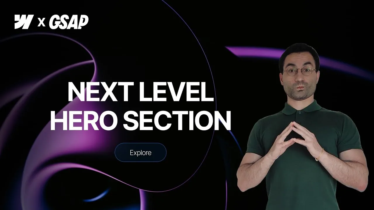
Build a spotlight effect in Webflow that follows the cursor across a hero image — a soft cone of light that reveals the photo where you point and lets everything else dissolve into darkness. It looks like something you’d need WebGL or a heavy plugin for, but it’s really just a radial gradient and one of Webflow’s oldest interactions, dressed up with a little math.
Then we push further. On top of the spotlight we layer a GSAP-powered hover animation that gently scales and rotates the image, and for the grand finale a custom SVG prism filter that splits the image into its red, green, and blue channels and shifts them apart for a premium color-shift glow. Three techniques, stacked, that add up to a hero section that feels genuinely alive.
The nicest part is how approachable each piece is on its own. The spotlight and the hover are pure Webflow — no code at all. The prism is the only part that needs a snippet, and it’s already written for you in the cloneable. Take it one layer at a time and you’ll walk away with a handful of tricks you can reuse everywhere.
How it works
The spotlight isn’t light at all — it’s darkness with a hole in it. You put a full-bleed div (the overlay) over the image and give it a radial gradient that’s transparent in the middle and black at the edges. The trick is tightening the color stops: a lazy fade looks like fog, so pulling the black in close (with a couple of semi-transparent stops around it) gives you a crisp circle of visibility that reads as a real spotlight. Crucially, the overlay lives between the image and the content in the navigator, so it darkens the photo but leaves your heading and text untouched on top.
To make it follow the cursor, you use the classic “mouse move over element” interaction on the section, moving the overlay from -50vw to 50vw across the X axis and -50vh to 50vh across the Y axis. Those are the exact distances from the center of the viewport to each edge, so the center of the spotlight lands precisely under the pointer. Bump the smoothing up around 95% and the motion turns silky. The catch: an absolutely positioned overlay only covers its parent, so the instant it moves it exposes an edge. The fix is to oversize it — scale width and height to 200%, then offset it -50% on top and left to recenter — so it always blankets the viewport no matter where the cursor pushes it. Setting the section’s overflow to hidden hides anything that spills past the edges.
There’s a stacking-context lesson baked in here too. The absolutely positioned image naturally sits above a static container, so simply reordering things in the navigator won’t put your content on top. Give the main container position: relative and both elements share the default z-index: auto — at which point DOM order wins, and the element that comes later renders on top. It’s a small setting with an outsized payoff, and worth internalizing because it bites people constantly.
The hover animation shows off the new GSAP-powered interactions. Instead of building separate “hover in” and “hover out” animations like the old system forced you to, you build one timeline (scale the image to 1.1, rotate it 3°) and set two triggers: mouse enter set to play and mouse leave set to reverse. Because it plays from its current position rather than restarting, flicking the cursor in and out feels continuous instead of jumpy. The prism is the finale: an SVG filter (its ID is prism-basic) splits the image into RGB channels via feColorMatrix, offsets each with feOffset, and recombines them with feBlend. Applied to the image with filter: url(#prism-basic), it does nothing at rest because the offsets are zero — the channels recombine perfectly. A small GSAP script grabs those feOffset nodes and animates their dx/dy values on hover (and on focus, for keyboard users), pulling the colors apart into that chromatic glow. Two gotchas: the filter embed must sit before the section in the DOM so it’s defined before it’s referenced, and the script goes at the end of the page so everything exists when it runs.
Here’s the filter exactly as it ships in the cloneable. Note color-interpolation-filters="sRGB" — it keeps the channel blend in the color space you’re actually looking at, instead of the linear space filters default to:
<!-- Embed placed before the section -->
<svg xmlns="http://www.w3.org/2000/svg" width="0" height="0" style="position:absolute">
  <defs>
    <!-- PRISM BASIC: splits R, G, B and shifts them slightly -->
    <filter id="prism-basic" color-interpolation-filters="sRGB">
      <!-- RED -->
      <feColorMatrix in="SourceGraphic" result="red" type="matrix"
        values="1 0 0 0 0
                0 0 0 0 0
                0 0 0 0 0
                0 0 0 1 0"/>
      <feOffset in="red" dx="0" dy="0" result="redShift"/>

      <!-- GREEN -->
      <feColorMatrix in="SourceGraphic" result="green" type="matrix"
        values="0 0 0 0 0
                0 1 0 0 0
                0 0 0 0 0
                0 0 0 1 0"/>
      <feOffset in="green" dx="0" dy="0" result="greenShift"/>

      <!-- BLUE -->
      <feColorMatrix in="SourceGraphic" result="blue" type="matrix"
        values="0 0 0 0 0
                0 0 0 0 0
                0 0 1 0 0
                0 0 0 1 0"/>
      <feOffset in="blue" dx="0" dy="0" result="blueShift"/>

      <!-- Recombine the three channels -->
      <feBlend in="redShift" in2="greenShift" mode="screen" result="rg"/>
      <feBlend in="rg" in2="blueShift" mode="screen" result="rgb"/>
    </filter>
  </defs>
</svg>
Each feColorMatrix is just a channel mask: the red one keeps row 1 and zeroes green and blue, and so on, with the last row preserving alpha. Then screen blending adds the three masked copies back together — which is why zero offsets give you the original image untouched.
And the script that animates it. Everything you’d want to tune sits in the constants at the top:
<!-- Embed at the end of the page -->
<script>
  // Wait until the DOM is fully loaded before running the script
  document.addEventListener('DOMContentLoaded', () => {

    // ===== CONFIGURATION CONSTANTS =====
    // Offsets (dx, dy) for each color channel
    const DX_RED   = -6
    const DY_RED   = -6
    const DX_GREEN = 0
    const DY_GREEN = 0
    const DX_BLUE  = 6
    const DY_BLUE  = 6

    // Duration and easing for the GSAP timeline
    const DURATION = 1.5
    const EASE     = 'power1.inOut'

    // ===== DOM ELEMENTS =====
    // Select the button using a custom attribute
    // (keeps class naming flexible)
    const prismButton = document.querySelector('[fc-prism-button]')
    if (!prismButton) return

    // Grab the filter by its ID
    const filter = document.querySelector('#prism-basic')
    if (!filter) return

    // Get the three <feOffset> nodes that shift R, G, and B
    const redOffset   = filter.querySelector('feOffset[in=red]')
    const greenOfset  = filter.querySelector('feOffset[in=green]')
    const blueOffset  = filter.querySelector('feOffset[in=blue]')

    // ===== GSAP TIMELINE =====
    // Build a paused timeline with default duration/ease
    // Animate all three offsets in parallel (position = 0)
    const tl = gsap.timeline({ paused: true, defaults: { duration: DURATION, ease: EASE }})
      .to(redOffset,   { attr: { dx: DX_RED,   dy: DY_RED   } }, 0)
      .to(greenOfset,  { attr: { dx: DX_GREEN, dy: DY_GREEN } }, 0)
      .to(blueOffset,  { attr: { dx: DX_BLUE,  dy: DY_BLUE  } }, 0)

    // ===== INTERACTION HANDLERS =====
    // Play or reverse the timeline based on hover/focus
    // Ensures pointer + keyboard accessibility
    prismButton.addEventListener('pointerenter', () => tl.play())
    prismButton.addEventListener('pointerleave', () => tl.reverse())
    prismButton.addEventListener('focus',        () => tl.play())
    prismButton.addEventListener('blur',         () => tl.reverse())
  })
</script>
The button is found by the fc-prism-button attribute — added with no value, just its presence — so your class names stay yours. The default constants pull red up-left by 6 and blue down-right by 6 while green stays put, which is what reads as a prism split; push them further apart for a louder aberration, or move only one channel for a subtler tint. Two things to keep in mind: the script grabs a single button (querySelector), so a second prism button on the same page needs the selection turned into a loop, and it reads the feOffset nodes by their in values — rename red/green/blue in the filter and the selectors stop matching.
How to use it
-
Clone the project. Grab the Webflow cloneable — it ships with the full hero structure, the tuned radial gradient, the interactions, and the SVG filter plus the GSAP script already written.
-
Pick a high-contrast image. The effect lives or dies on the photo. Choose one with bold light-and-dark areas, strong gradients, and striking highlights — flat images look dull under the spotlight. Paweł Czerwiński’s Unsplash profile is a goldmine for exactly this style. Set the image to
width: 100%,height: 100%,object-fit: cover,position: absolute(full), and give its parent containerposition: relativeso your content stays on top. -
Build the spotlight overlay. Add a div between the image and the content, position it absolute (full), and give it a radial gradient that goes from transparent in the center to black at the edges. Tighten the stops until the circle of light feels crisp rather than foggy, then scale the overlay to
200%width and height and offset it-50%on top and left. Set the section toheight: 100vh,overflow: hidden,position: relative. -
Make it follow the cursor. On the section, add a classic “mouse move over element” interaction. Animate the overlay’s move transform:
-50vw/50vwon X,-50vh/50vhon Y. Turn smoothing up to about 95% and preview — the spotlight should glide under your pointer. -
Add the hover animation. Switch to GSAP-powered interactions on the button. Build one custom animation targeting the image class (scale
1.1, rotate3°, duration1.5s, easingpower1.inOut), then add two triggers: mouse enter → play, mouse leave → reverse. -
Drop in the prism filter. Add an Embed element, paste in the SVG filter above, and place it before the section in the navigator. Apply it to the image via a custom property
filter: url(#prism-basic). Then add a second Embed with the GSAP script and place it at the end of the page. Finally, add the attributefc-prism-buttonto your button (no value needed) so the script can find it whatever its class is, and play with theDX_/DY_constants at the top of the script to dial the color shift in.