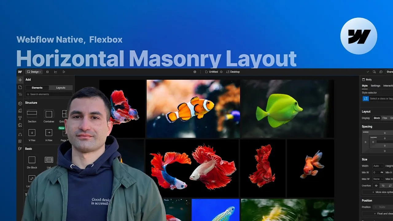
Build a horizontal masonry layout in Webflow where photos fill out rows while keeping their own aspect ratio — fully responsive, genuinely accessible, and without a single line of custom code. It’s the horizontal counterpart to a vertical masonry grid: images sit side by side, stretch to fill each row neatly, and reflow gracefully on any screen size.
The whole thing runs on Flexbox, so it’s also one of the best hands-on ways to really feel how flex-grow and flex-shrink behave. Inspired by a classic CSS-Tricks article, the layout leans on a handful of properties that quietly collaborate to size every item for you.
We start from static images, then apply the exact same setup to a CMS collection, and finish by dropping in a GSAP staggered animation so the images slide and fade in as they scroll into view. Accessibility isn’t an afterthought here — it’s baked into the structure from the first element.
How it works
The foundation is an unordered list, and that choice is deliberate. When content lives in a list, you’re explicitly telling assistive tech that these items belong to one structured set: a screen reader announces “list, 12 items” and reads each image as part of a sequence. That, plus clear alt text on every image, is what makes the gallery accessible rather than just a wall of pictures. The list gets display: flex, wrapping turned on so children flow into multiple rows, a small gap, and its default bullets and left/bottom padding removed.
The masonry magic is one idea: let the items decide their own widths, then fill the row. Each gallery item gets a fixed-ish height (36vh on desktop is a completely arbitrary starting value — pick whatever shows your photos well) while its width is left to the image’s aspect ratio. On its own that leaves a ragged single row, so you set the item’s flex-grow and flex-shrink both to 1. Now the items cooperate: they expand to fill each row edge-to-edge and shrink to avoid horizontal overflow when a row runs out of space. Because the item is now stretching, the image inside — sized to 100% width and height — would distort, so object-fit: cover steps in to preserve each photo’s real aspect ratio.
There’s one cosmetic snag: the last item often grows to hog whatever space is left on the final row, which looks off. The fix is an extra list item acting as a spacer — a combo class with flex-shrink: 0 and flex-grow: 10 (10 is just what looked best, no science to it). But an empty list item is a red flag for accessibility: it tells a screen reader “here’s an item” when there’s nothing inside. The remedy is a one-liner — add aria-hidden="true" to that empty item so screen readers skip it as decorative.
Here are the core rules the Webflow settings map to:
.gallery-list {
  display: flex;
  flex-wrap: wrap;      /* "Wrap" under Layout */
  gap: 1.5rem;
  list-style: none;     /* No bullets */
  padding-left: 0;
  padding-bottom: 0;
}

.gallery-item {
  height: 36vh;         /* arbitrary — tune per breakpoint */
  flex: 1 1 0;          /* grow: 1, shrink: 1 */
}

.gallery-item-image {
  width: 100%;
  height: 100%;
  object-fit: cover;    /* keep the real aspect ratio */
}

/* spacer that tidies the last row */
.gallery-item.cc-last {
  flex-grow: 10;
  flex-shrink: 0;
}
Responsiveness is just fine-tuning those numbers per breakpoint: a smaller height on tablet, and in landscape it’s often cleaner to switch perspective entirely — set the item’s width to something like 28vw and its height to auto, since the viewport is wide and short. On mobile portrait, images stack, so you can revert to a height-based value and simply set the spacer item’s display to none.
How to use it
-
Clone the project. Grab the Webflow cloneable — it ships with the full structure and styling so you can dissect every setting described above.
-
Build the list. Inside your section content wrapper, add an unordered list with a
gallery-listclass, set it todisplay: flex, enable Wrap under Layout, add a small gap, remove the bullets under list settings, and zero out its left and bottom padding. -
Set up one item, then duplicate. Give the single list item a
gallery-itemclass and an arbitrary height (start at ~36vh). Drop an image inside with agallery-item-imageclass at 100% width and height. Under Flex child, set both grow and shrink to 1. Then duplicate the item to fill your gallery (12 works well) and swap in each photo. -
Fix the aspect ratio. Select the image and set object-fit to
coverso photos keep their proportions as items stretch. Adjust the focal position only if a particular photo needs it. -
Tidy the last row (if needed). If the final item stretches awkwardly, add one more list item with the
gallery-itemclass plus a combo class (e.g.cc-last), and under Flex child set shrink to 0 and grow to 10. Then add the attributearia-hidden="true"to that empty item so screen readers ignore it. -
Make it responsive. Retune the item height on tablet, switch to a width-based value (e.g. 28vw) with
height: autoin landscape, and on mobile portrait revert to a height value and set the spacer item’s display to none. -
Move it to the CMS (optional). Assign
gallery-list,gallery-item, andgallery-item-imageto the collection list, item, and image. The “empty” spacer is simply a collection item with no image; target it with the built-in last item state in the selector dropdown so you can style it without a combo class. Add a text field foraria-hidden(true on the empty item, false on the rest) and bind it to the item’s aria-hidden attribute. Remember a real client project also wants a text field for each image’s alt text. -
Add motion (optional). To make the gallery slide and fade in on scroll, reuse Francesco’s GSAP staggered-animation solution: paste its script and add its staggered-list attribute to the
gallery-listelement, leaving the defaults as-is. Publish and check the live page — the stagger only runs at runtime, not in the Designer.