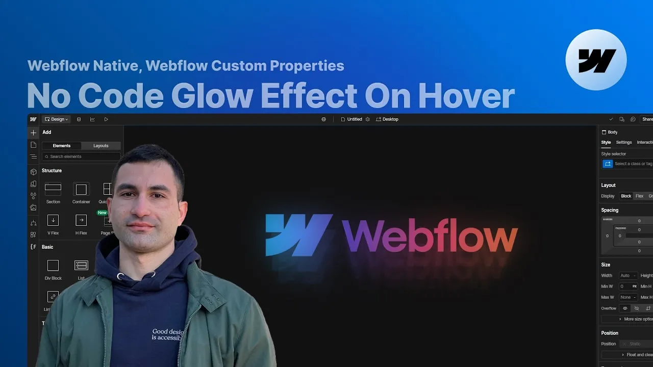
Add a glowing logo-on-hover effect in Webflow — the kind where a logo softly blooms and radiates light as your cursor lands on it — using nothing but native tools: CSS masking, a backdrop-filter blur, and Webflow’s own move and scale transforms wired into a hover interaction.
What makes this one fun is that it stitches together a handful of techniques that are each useful on their own. You’ll use custom properties to mask an image, a backdrop-filter to blur a layer behind another, and layered opacity to fake real depth. Learn how they fit together here and you can pull any one of them out for a completely different project.
There’s no JavaScript and no plugin. Everything lives in the Designer, driven by properties you can see and tweak, so once you understand the structure you can rebuild it from scratch and bend it to whatever you’re making.
How it works
The whole thing is a small stack of layers, and the trick to understanding it is that the page is built in its final state — the way it looks mid-hover — on purpose. When an animation is this layered, designing the end result first means every piece is visible in the Designer, so you can read the exact values you’ll animate and adjust them in context instead of guessing at an invisible target.
The glow itself is faked with depth. Inside a glow effect wrapper (set to position: relative so it can anchor everything else), there are several masked copies of the logo. Each copy is a glow effect masked wrapper — absolutely positioned, filling the wrapper — and the only differences between them are opacity and transform. The copies run at roughly 15%, 10%, and 4% opacity, pushed progressively downward and scaled down a touch, which is what reads as a soft radiating bloom rather than a flat shape.
The masking is the crucial part, and it’s done with three Webflow custom properties on the glow effect masked element (the ones at the very bottom of the Style panel). mask-image is set to url(...) pointing at the logo image copied from the Assets panel; mask-repeat is no-repeat; and mask-size is 100%. The element underneath carries a linear gradient — that gradient is the color you see, and the mask simply cuts it into the logo’s shape. One detail that looks like a magic number but isn’t: the masked element’s aspect-ratio is set to the mask image’s real pixel dimensions (read them from the asset’s edit-settings panel), so the shape never distorts.
On top sits the blur. Two things do the blurring. An outermost glow effect blur panel covers the section with a 30px backdrop-filter: blur and pointer-events: none — it blurs the logo through it while still letting your hover reach the logo underneath. And inside each masked layer there’s a glow effect blur mask element with its own smaller backdrop blur (9px, 7px, 5px across the layers) to soften each copy. Make that blur element noticeably wider than its parent (around 90vw) and center it with left: 50% plus a -50% x-transform — if you leave it near 100% width the blur gets sharply clipped at the edges, which ruins the effect.
Finally, the motion. A Mouse Hover interaction on the glow effect wrapper animates the masked copies’ move and scale transforms and the top blur panel’s opacity. In the initial state everything lines up on the logo (move 0%, scale 1, blur opacity 0%); on hover the three layers fan downward and shrink (move 35% / 65% / 90%, scale 0.95 / 0.9 / 0.8) while the blur opacity rises to 35%. An ease-out-cubic easing on the transforms gives it that smooth settle, and the hover-out animation is just the same steps returning to the resting values.
How to use it
-
Clone the project. Grab the Webflow cloneable so you have the full layer structure, the gradient fill, and the interaction already wired up to inspect and adapt.
-
Set up the wrapper. Give the section
position: relativeand theglow effect wrapperposition: relativetoo, so the absolutely positioned masked layers and blur panels have a reference to anchor to. -
Mask your logo. Upload your logo to the Assets panel. On the
glow effect maskedelement, add the three custom properties:mask-imageasurl(...)with the asset’s copied link,mask-repeatasno-repeat, andmask-sizeas100%. Set the masked wrapper’saspect-ratioto the image’s real width and height (from its edit-settings panel), and give the masked element a linear-gradient background for the glow color. -
Stack the layers. Duplicate the masked wrapper a few times, absolutely position each to fill the wrapper, and drop their opacity progressively (about 15%, 10%, 4%). Inside each, add the blur-mask element with a
backdrop-filterblur (9/7/5px), a width around90vw, andleft: 50%with a-50%x-transform to center it. -
Add the top blur. Place the outermost
glow effect blurpanel over the section withbackdrop-filter: blur(30px)andpointer-events: noneso it emphasizes the glow without blocking the hover. -
Wire the hover interaction. On the
glow effect wrapper, add a Mouse Hover interaction. In the hover-in animation, set the layers’ move/scale/blur-opacity to the resting values and mark them as the initial state, then animate to the fanned-out values (move35/65/90%, scale0.95/0.9/0.8, opacity35%) on the 0s keyframe withease-out-cubic. Duplicate it for the hover-out and return everything to the resting values. -
Make it yours. To mask a photo instead of a solid glow, swap the masked element’s gradient background for an image — the mask shape stays, only the fill changes. Adjust the page background and blur amounts to taste.