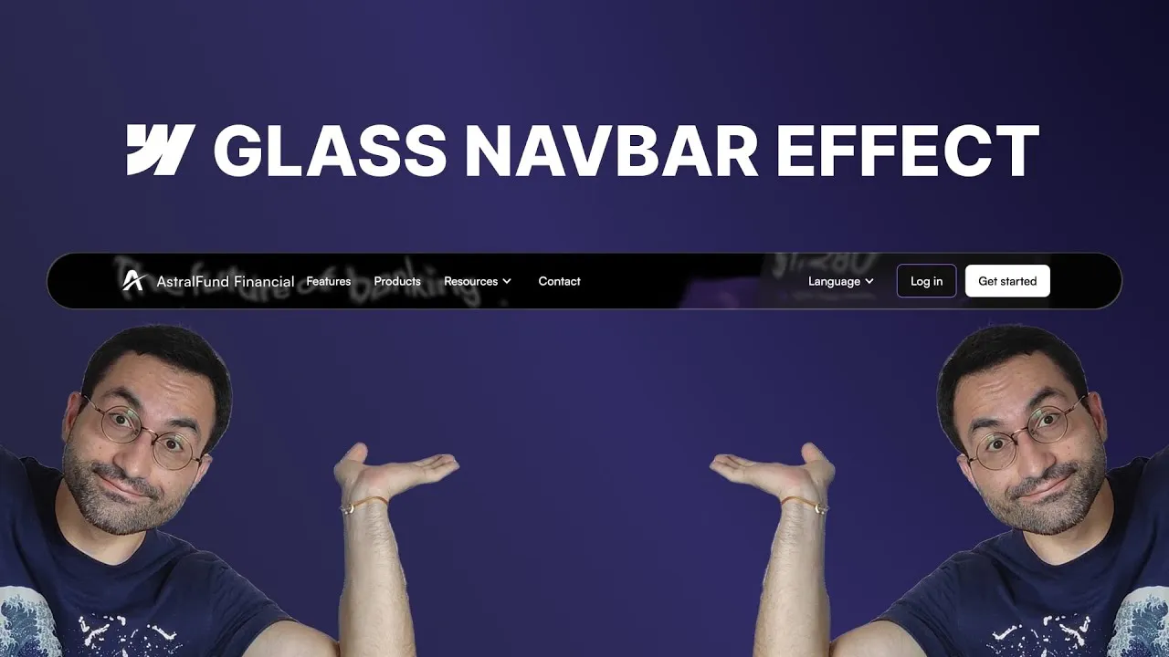
Recreate that gorgeous Apple liquid glass navbar right inside Webflow — the smooth, frosted, slightly liquid bar that distorts whatever scrolls beneath it. No external libraries, no heavy code: just native Webflow elements, a tiny SVG filter, and a bit of clever layering.
The trick is that “glass” isn’t one property you toggle on. It’s a few simple layers doing small jobs — a blur, a tint, a shine — stacked so they read as one polished surface. Once you see how the pieces fit, you can tune the whole thing to taste, from barely-there frost to full Apple-style refraction.
How it works
Start by prepping the navbar itself. Make it sticky with a top offset, push it above everything with a high z-index, and don’t let it span the full width — a calc(100% - 2rem) width with margin-left: auto and margin-right: auto centers it with a little breathing room on each side. A generous border-radius (think 50rem) gives you pill-rounded corners regardless of the navbar’s height. Two subtle box shadows on the navbar — a soft drop shadow and a wider, very faint one — make it feel like it’s hovering slightly above the page. You’ll barely notice them alone, but they quietly sell the depth once the glass goes on.
The glass itself is three absolutely-positioned layers dropped inside the navbar, each set to “full” so it covers the whole bar, and each placed before the navbar’s link wrapper so it never blocks your menu:
- Glass effect layer — carries a small
backdrop-filter: blur(around 3px) and, later, the SVG filter. This is the layer that bends the content behind it. - Glass tint layer — a flat background color at low opacity (white at ~25% to start; the video later swaps it to black at ~60% for a more solid, anchored look). This is the frosted wash.
- Glass shine layer — two
insetbox shadows in white simulate the light catching the top-left edge and the opposite corner, giving that faint inner glow. Softening them from ~50% to ~30% opacity keeps the corners from looking harsh.
One gotcha: the rounded corners live on the navbar, and the new layers don’t inherit them by default. Instead of retyping 50rem three times, set each layer’s border-radius to inherit (as a custom value) and its overflow to hidden. Now every layer clips to the navbar’s shape automatically, even if you change the radius down the road.
The real magic is the SVG filter. A plain CSS blur only softens what’s behind the bar; an SVG displacement filter actually distorts it, so scrolling content warps in a fluid, organic way. You paste the filter into an embed element (the <svg> wrapper carries display: none — it renders nothing, it’s just a definition to reference), then apply it to the glass effect layer with a custom CSS property: filter: url(#glass-distortion), using the filter’s ID. Here’s the whole thing, exactly as it ships in the cloneable:
<!-- Embed inside the navbar, before the nav link wrapper -->
<svg style="display: none">
  <filter id="glass-distortion" x="0%" y="0%" width="100%" height="100%" filterUnits="objectBoundingBox">
    <feTurbulence type="fractalNoise" baseFrequency="0.015 0.015" numOctaves="1" seed="5" result="turbulence" />
    <!-- Other seeds worth trying: 14, 17 -->

    <feComponentTransfer in="turbulence" result="mapped">
      <feFuncR type="gamma" amplitude="1" exponent="10" offset="0.5" />
      <feFuncG type="gamma" amplitude="0" exponent="1" offset="0" />
      <feFuncB type="gamma" amplitude="0" exponent="1" offset="0.5" />
    </feComponentTransfer>

    <feGaussianBlur in="turbulence" stdDeviation="3" result="softMap" />

    <feSpecularLighting in="softMap" surfaceScale="5" specularConstant="1"
      specularExponent="100" lighting-color="white" result="specLight">
      <fePointLight x="-200" y="-200" z="300" />
    </feSpecularLighting>

    <feComposite in="specLight" operator="arithmetic"
      k1="0" k2="1" k3="1" k4="0" result="litImage" />

    <feDisplacementMap in="SourceGraphic" in2="softMap" scale="60"
      xChannelSelector="R" yChannelSelector="G" />
  </filter>
</svg>
Three parameters do the tuning: scale on the displacement map controls the intensity (150 is strong; 60–80 is refined), base frequency on the turbulence sets how wavy the noise is (0.01 is default; 0.015 is a touch more liquid), and standard deviation on the Gaussian blur spreads the distortion. Scale moves the needle most, base frequency second. The values above — base frequency 0.015, standard deviation 3, scale 60 — are the balanced, Apple-close combo. The seed is a free extra: it reshuffles the noise pattern without changing its character, so if the warp lands awkwardly on your layout, try 14 or 17 before touching anything else.
Worth knowing what’s actually load-bearing in there. The filter’s output is whatever the last primitive produces, and that’s feDisplacementMap bending SourceGraphic with softMap — reading the red channel for horizontal displacement and green for vertical. So the real chain is just turbulence → blur → displace. The feComponentTransfer result (mapped) is never read, because the blur takes in="turbulence", and nothing reads litImage either — the specular lighting pair is a leftover hook for a lit-edge variant. Both are harmless, and they’re handy to experiment with, but if you’re trimming the embed down that’s what you can delete.
How to use it
-
Clone the project. Grab the SVG glass effect cloneable — it ships with the finished navbar, the layer structure, and the exact SVG filter code (built on the Astral Fund Bank base). The filter markup lives inside the embed there, so you never have to write it from scratch.
-
Prep the navbar. Set it to
position: sticky, give it atopoffset and a high z-index, set the width tocalc(100% - 2rem)withmargin-left/margin-rightset toauto, and add a largeborder-radiusfor fully rounded corners. -
Add depth. On the navbar, add two outside box shadows — a soft one (roughly Y offset 6px, blur 6px) and a wider faint one (blur ~20px, black at ~10%). They’re subtle on purpose.
-
Build the three layers. Inside the navbar, add three div blocks — glass effect, glass tint, glass shine — each
position: absolute, set to full, and placed before the navbar link wrapper. Put a small backdrop blur on the effect layer, a low-opacity background on the tint layer, and two inset white box shadows on the shine layer. -
Fix the corners. On all three layers, set
border-radiustoinheritandoverflowtohiddenso they clip to the navbar’s rounded shape. -
Add and apply the SVG filter. Drop an embed element inside the navbar (before the link wrapper) and paste in the filter above — the
<svg>already carriesdisplay: none, so it renders nothing. Then select the glass effect layer, add a custom CSS propertyfilterwith the valueurl(#glass-distortion)(match the filter’s ID), and scroll — the content beneath now distorts like real glass. -
Fine-tune. Open the embed and adjust the filter: lower scale (try 60–80) for a more delicate distortion, nudge base frequency toward 0.015 for more wave, leave standard deviation around 3, and swap the seed (14 or 17) if the noise pattern falls badly on your layout. Then polish the look — soften the shine shadows, bump link text to full opacity for legibility, and dial the tint darker if you want the bar to feel more solid.