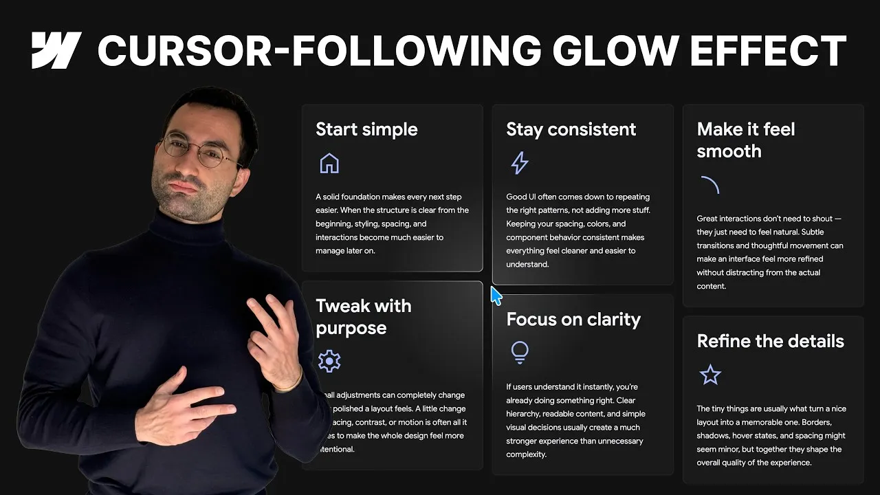
Build a glow that follows the cursor across a grid of cards in Webflow — one that feels like a single soft light traveling over the whole layout, yet stays perfectly clipped inside each card. It looks like the kind of thing that should need a pile of JavaScript, and the fun part is that it really doesn’t.
The whole effect comes from a smart combination of a CSS radial gradient, background-attachment: fixed, a handful of Webflow variables, and two classic interactions. Once you see how the pieces fit, it stops feeling like magic and starts feeling like a system you can bend however you want — bigger glow, different color, sharper border, softer fade.
And the best part: once the foundation is in place, adding the glowing border on top costs almost nothing. Same logic, one extra div, zero extra animation.
How it works
The glow is not a blurred div being dragged around. It’s a radial gradient used as the background image of the cards themselves, which is exactly why it always stays clipped inside each card — a background can’t spill past the box it’s painted on. Here’s the entire CSS the effect runs on, straight from the cloneable’s global-styles embed — every value is a Webflow variable, and the second rule is the glowing border we’ll get to below:
<!-- Global styles embed -->
<style>
  .section_card {
    background-attachment: fixed;
    background-image: radial-gradient(circle at var(--x) var(--y), var(--glow-color), transparent var(--glow-size));
  }

  .section_card-wrapper {
    background-attachment: fixed;
    background-image: radial-gradient(circle at var(--x) var(--y), var(--border-glow-color), transparent var(--glow-size));
  }
</style>
That’s it. Two rules, four variables, no JavaScript.
The keystone is background-attachment: fixed. Normally a background belongs to its element and moves with it. Set it to fixed and the background is painted relative to the viewport instead. So even though each card carries its own gradient, all of those gradients behave like cropped windows onto one larger background layer that stays still on screen. Move the center of that shared gradient and it reads as one continuous glow sliding across the whole grid — while each card keeps clipping its own slice. That’s the entire illusion.
Because the gradient’s center (--x, --y), color (--glow-color), and reach (--glow-size) are all Webflow variables, you drive the effect from the Variables panel. Two interactions animate them. A Mouse hover on the section fades the glow in and out by pushing the opacity variable from 0% up to ~15% and back — desktop-only, since touch devices have no hover. The real workhorse is a Mouse-move-in-viewport interaction attached to the page, not the section: it maps --x from 0dvw (far left) to 100dvw (far right) and --y from 0dvh (top) to 100dvh (bottom), with a low smoothing value so the glow trails the cursor closely. It lives on the page because the background is viewport-relative — the trigger has to track the viewport too.
The glowing border is the same system reused. Wrap each card in a new div, move the bottom margin to the wrapper, and give the wrapper 1px of padding on all sides — that tiny gap fakes the border, no border property involved. Then apply the identical gradient to the wrapper, matching the card’s border radius so they align. The only difference is the color: the wrapper rule swaps --glow-color for --border-glow-color, which multiplies the opacity by five, so the border glow reads sharper and brighter. Crucially there’s no new animation: the wrapper’s gradient references the same --x, --y and --glow-size, so the interaction you already built drives both glows in perfect sync.
How to use it
-
Clone the project. Grab the Webflow cloneable — it ships with the card grid, the global-styles CSS embed, the variables, and both interactions already wired up.
-
Find the gradient. Open the global-styles
Embedelement. The rule on.section_cardsetsbackground-attachment: fixedand aradial-gradientbackground image whose center, color, and size are all Webflow variables — that’s your glow. -
Tune it from the Variables panel. Open the glow background properties collection.
XandY(default50dvw/50dvh) set the glow’s resting center;opacitydrives the alpha of the glow color (starts at0%, so the glow is invisible until you hover);glow sizecontrols how spread-out and diffused it looks. Change colors, size, or the opacity range to taste. -
Check the two interactions. The section’s Mouse hover fades opacity between
0%and15%(desktop only). The page’s Mouse-move-in-viewport mapsXfrom0dvw→100dvwandYfrom0dvh→100dvh; lower the smoothing for a tighter follow, raise it for more lag. -
Add the border glow (optional). Wrap a card in a new div with the
section_card-wrapperclass, move the bottom margin onto the wrapper, and give it1pxpadding, a near-transparent background color, and the card’s border radius. In the CSS embed, duplicate the gradient rule for.section_card-wrapperswappingvar(--glow-color)forvar(--border-glow-color)— no new interaction needed. -
Preview and play. Switch to preview mode (no publish required) so the hover interaction can fire, then move the cursor and watch the glow travel across the grid. Adjust colors, glow size, smoothing, and the opacity range until it feels right.